Comic book announcements seem to come in fits and starts. Fans may go weeks without hearing any news that’s of particular interest, then all of a sudden somebody makes a big announcement and it seems like everybody else has to make a bunch of their own just to keep up. This week came several announcements from different publishers about upcoming projects, many of which have me very excited, and one of which…well, you’ll see. But before we even start I’m going to say that this is not a COMPREHENSIVE list of projects. These are just some of the things that were announced that interest ME, and that make me feel ways about things. Sorry, “release date for Midnight Marvel” – ya didn’t quite make the cut.
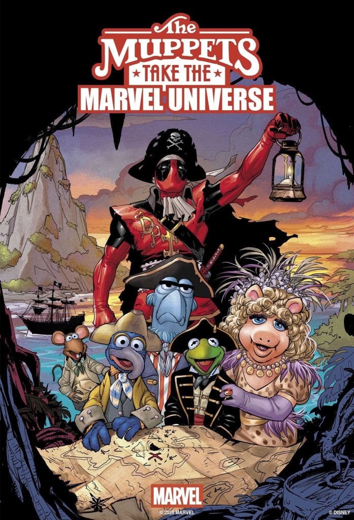
Marvel DID have one thing announced on Monday that I find pretty interesting, a one-shot special coming out this fall in which the Marvel superheroes will – for the first time – team up with some of my favorite corporate siblings of theirs. This fall, we’re going to get the crossover we never knew we needed: The Muppets Take the Marvel Universe.
The Muppets have appeared in comics before, even published by Marvel a few times. There have even been a few Marvel variant covers featuring the Muppets. But this will mark the first time that the Muppets and the Marvel heroes will actually meet in a story, and I’ve got to tell you, I couldn’t be more excited for it. In the main story, by Chip Zdarsky and Pete Woods, the X-Men’s old foe Mojo apparently kidnaps Rowlf the Dog, bringing Kermit the Frog and company in cahoots with some of Marvel’s all-stars in order to rescue him.
This is actually such a perfect set-up. Mojo is an interdimensional parody of a corporate media executive, obsessed with ratings and viewership. That’s what makes Rowlf the perfect central character for this story. As opposed to Fozzie’s cringe comedy or Gonzo’s stunts that are guaranteed to go wrong, Rowlf is simply a gifted piano player, one of the few Muppets that is unabashedly GOOD at what he’s trying to do, and thus he’s exactly the kind of character that would be on Mojo’s radar. Crossovers like this will be inherently silly, and that’s welcome, but they’re at their best when they play to the characters’ strengths this way.
There will be back-up features in the book as well, similar to the recent Marvel/DC crossover comics. Hank Pym and Bruce Banner will visit Bunsen and Beaker at Muppet Labs, and Dr. Strange will star in a bizarre team-up with the Swedish Chef. As Disney proper struggles with what to do with the Muppets (despite the fact that the Muppet Show special earlier this year was both a critical and streaming smash hit, and any idiot would have greenlit a revival series by now) at least SOMEBODY out there has the wherewithal to celebrate the 50th anniversary of The Muppet Show the way it deserves.
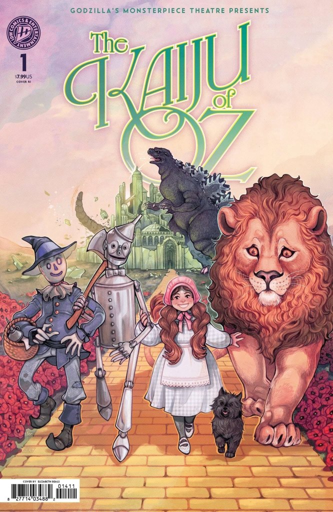
A few hours after Marvel’s big announcement, IDW came in with a project of their own that seems to have been aligned perfectly to intersect the venn diagrams of my personal obsessions. IDW has held the Godzilla comic book license for many years now, and for the last few years they’ve published miniseries and one-shots under the banner Godzilla’s Monsterpiece Theater. The first miniseries was a crossover mash-up in which Godzilla encountered public domain characters such as Dracula, Sherlock Holmes, the time traveller from H.G. Welles’ The Time Machine, and – most perplexingly – Jay Gatsby. Follow up one-shots have dropped him in Verona during the events of Romeo and Juliet and ancient Greece to further complicate Odysseus’s journey home during The Odyssey. But this September we’re getting a book that excites me like no other: The Kaiju of Oz.
I am, as people who’ve read this blog for a long time know, an unabashed fan of L. Frank Baum’s Oz books, as well as many of the expanded universe books, movies, and comics that have been published in the decades since Oz entered the public domain. And Oz crossovers aren’t a new thing – we’ve seen lots of stories about Dorothy and Alice (from Wonderland, obviously), stories where the characters interact with the DC Multiverse, the characters join the fairy tale kitchen sink of ABC’s Once Upon a Time, and plenty of other incarnations and crossovers. IDW, for their part, has also produced a series of one-shots in which Godzilla stomps on various American cities like New York, Boston, and Los Angeles. (Hey, IDW, if you ever want to go Godzilla Vs. New Orleans, give me a call. I’ve got a story for you.) Having Godzilla march in to crush the Emerald City sounds like a hell of a lot of fun. Hopefully the creative team of Mike Costa and Ryan Browne are familiar enough with the Oz mythology to use the characters to their true potential. I don’t care how good his brain is – the Scarecrow isn’t going to be much of a match for Godzilla. But if Glinda, Ozma, Professor Wogglebug and some of the other Oz luminaries step up to the plate, it could be a pretty exciting showdown.
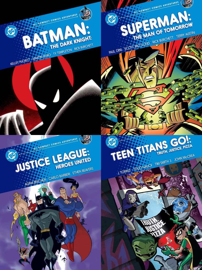
DC Comics, meanwhile, announced the latest expansion of their excellent Compact Comics graphic novels line, the series of smaller-sized paperbacks with a smaller price point that have taken the comics world by storm. They STILL haven’t taken any of MY suggestions (philistines), but what they announced this week is perhaps the next best thing. Recognizing what a great series this is for introducing new readers to comics, DC announced four “Compact Comics Adventures” books for younger readers, specifically collections of the comics based on some of their most popular cartoons: Batman: The Animated Series, Superman: The Animated Series, Justice League, and Teen Titans. DC has a pretty deep bench of comics for young readers that they could draw from, but a lot of them wouldn’t quite be long enough to justify the Compact Comics format. These series are a nice compromise, with comics appropriate for young readers but that will appeal to the nostalgia factor of people who grew up with the cartoons.
A lot of these comics have been out of print for decades, and some have never been collected at all, so this will be a great collection. Best of all, these will be even MORE bargain-priced than the main line, with each book collecting six issues for $7.99 (as opposed to $9.99 for the other books). My sister is always asking me for graphic novel suggestions for her 12-year-old son, and as soon as I heard about these, I texted her.
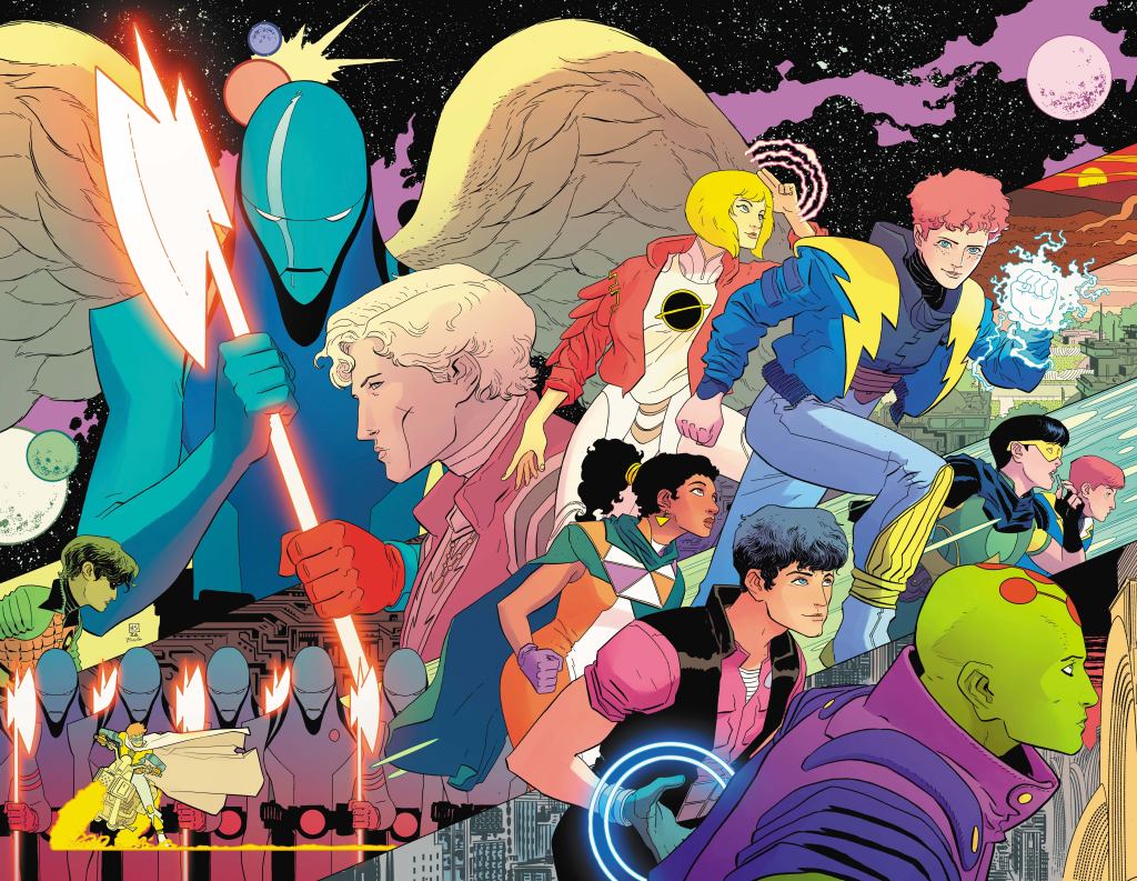
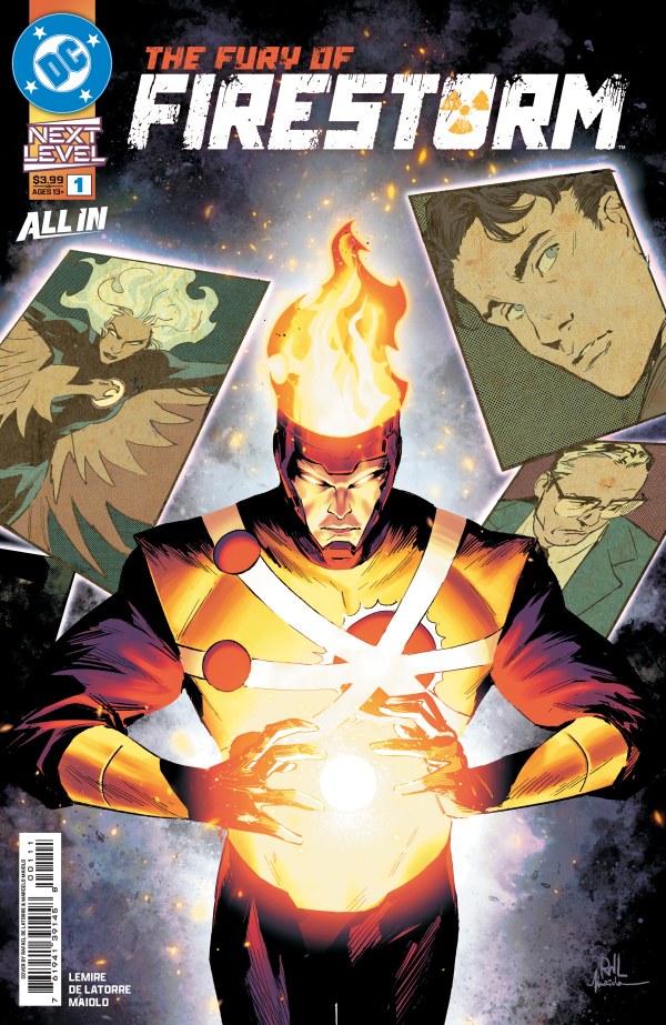
The next announcement is the one that I’ve got a little trepidation about. Earlier this year DC began a new line of titles called “Next Level,” bringing back characters that haven’t had a big spotlight in some time for new titles that – although part of the DC Universe – are largely self-contained. New books starring the likes of Batwoman, Lobo, Deathstroke, and Barbara Gordon (not as Batgirl or Oracle, but in an intriguing book where she’s going to prison as part of an undercover sting operation) have been well-received, and I’ve been especially impressed by the new takes on Firestorm and Deadman. This week DC announced three team books joining the Next Level lineup: Doom Patrol, Teen Titans, and most pertinently, Legion of Super-Heroes.
I am, of course, a Legion superfan. I’ve been itching for YEARS for DC to come back and give us a solid Legion series again. And the fact that it’s being written by Joshua Williamson, an excellent writer that’s just been killing it on Superman for the last few years, was very welcome news. But then I kept reading and…well, let me just give you the synopsis of the first issue that DC released:
One thousand years after the Last Son of Krypton’s rocket crashed on the Kent Farm comes a new future inspired by the Man of Tomorrow! But this new future is in danger! Superheroes are outlawed! Deadly enforcers known as the Persuaders keep the populace of the United Planets in check! Worlds are at war! And this dark tomorrow’s last glimmer of hope, R.J. Brande, has been brutally murdered. Can the mysterious Brainiac 1 of 5 solve Brande’s murder? To restore hope to the universe, he must assemble a legion of gifted young rebels from across the cosmos!
…yeah. It’s another freaking reboot.
This will be, by my count, the SIXTH incarnation of the Legion of Super-Heroes, and as much as I enjoy Williamson’s writing, that has SERIOUSLY diminished my enthusiasm. We’ve seen the Legion assembled countless times. There’s a reason James Gunn didn’t start his Superman movie with an origin – because nobody needs it anymore. What’s more, each reboot version of the Legion has proven to have a shorter lifespan than the one before it. The most recent one, by Brian Michael Bendis, lasted a mere 19 issues plus a two-issue prequel and a six-issue miniseries where they faced the Justice League. If this keeps up, the next Legion after Williamson’s will be a one-shot.
Mr. Williamson, should you be reading this, please don’t take my lack of enthusiasm personally. I like your work very much. I was VERY excited to hear that you were writing this team. But no matter how great the creative team is, it’s going to be an uphill battle to make me invested in Iteration Six when my heart still belongs mostly to One. (And, in large part, to Two.)
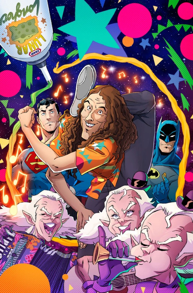
You know, I can’t end this on a down note. How about one more super-cool DC announcement? For a few years now Dan Mora – one of my favorite working comic artists – has been doing a series of variant covers of the World’s Finest comic with Superman and Batman meeting various celebrities like William Shatner and Nicolas Cage. Earlier this year DC released two at once, one with Weird Al Yankovic and then another, on a Bizzaro comic, where they encountered Al’s imperfect counterpart “Normal Al Yankovic.” As it turned out, that was just the beginning. Coming this fall World’s Finest writer Mark Waid is going to give us a one-shot where DC’s top heroes are going to encounter the universe’s greatest musical genius, Batman/Superman/Weird Al: World’s Weirdest. I haven’t read anything about the story, I don’t know what it’s going to be about. It doesn’t matter. This is going to be the greatest comic since…
…well, since Spider-Man met the Muppets.
So call up your local comic shop and place your orders, friends. There’s lots of cool stuff coming soon.
Blake M. Petit is a writer, teacher, and dad from Ama, Louisiana. His most recent writing project is the superhero adventure series Other People’s Heroes: Little Stars, volume one of which is now available on Amazon. He’s also started putting his LitReel videos on TikTok. He means it, IDW. Think about Godzilla biting into a certain trademarked New Orleans beignet shop and then coming up with powdered sugar covering his enormous muzzle. That’s just the start.
Last year (in Geek Punditry #119) I told you guys about DC Comics’ new “Compact Comics” format – a line of bargain-priced paperback editions that collect seminal and popular DC Comics storylines in a smaller format. At $9.99 a pop, these books were quickly recognized as being some of the best deals in comic books, and to date they’ve released or announced no less than 45 volumes in this series. It’s become so popular that everybody else is copying them – Oni Press is doing their own “Compact Comics” in the same size and price point (as mentioned in Geek Punditry #164) and Marvel, Boom! Studios, and IDW have all launched lines of books only slightly larger and slightly more expensive ($14.99 instead of $9.99) which are clearly intended to appeal to the same market.
With the books being so popular, I gave DC some helpful suggestions last year (in GP #124) of other comics and storylines that I thought were deserving of the Compact Comics treatment. To date, they have run with exactly zero of my suggestions. But that’s okay, I know they’re just playing hard to get.
With everybody else getting in on the fun, this year I’m going to offer more suggestions, but not just for DC. I’m going to throw out a suggestion or two for each of the five publishers (so far) that have gotten into this particular game. And as we know they’re all reading this, I assume you can expect to see these books on store shelves by next Tuesday. Obviously, I won’t suggest anything that’s already in the works, but if you’re interested in seeing what’s available, I’ve compiled a list of everything that’s been announced so far over at my League of Comic Geeks page.
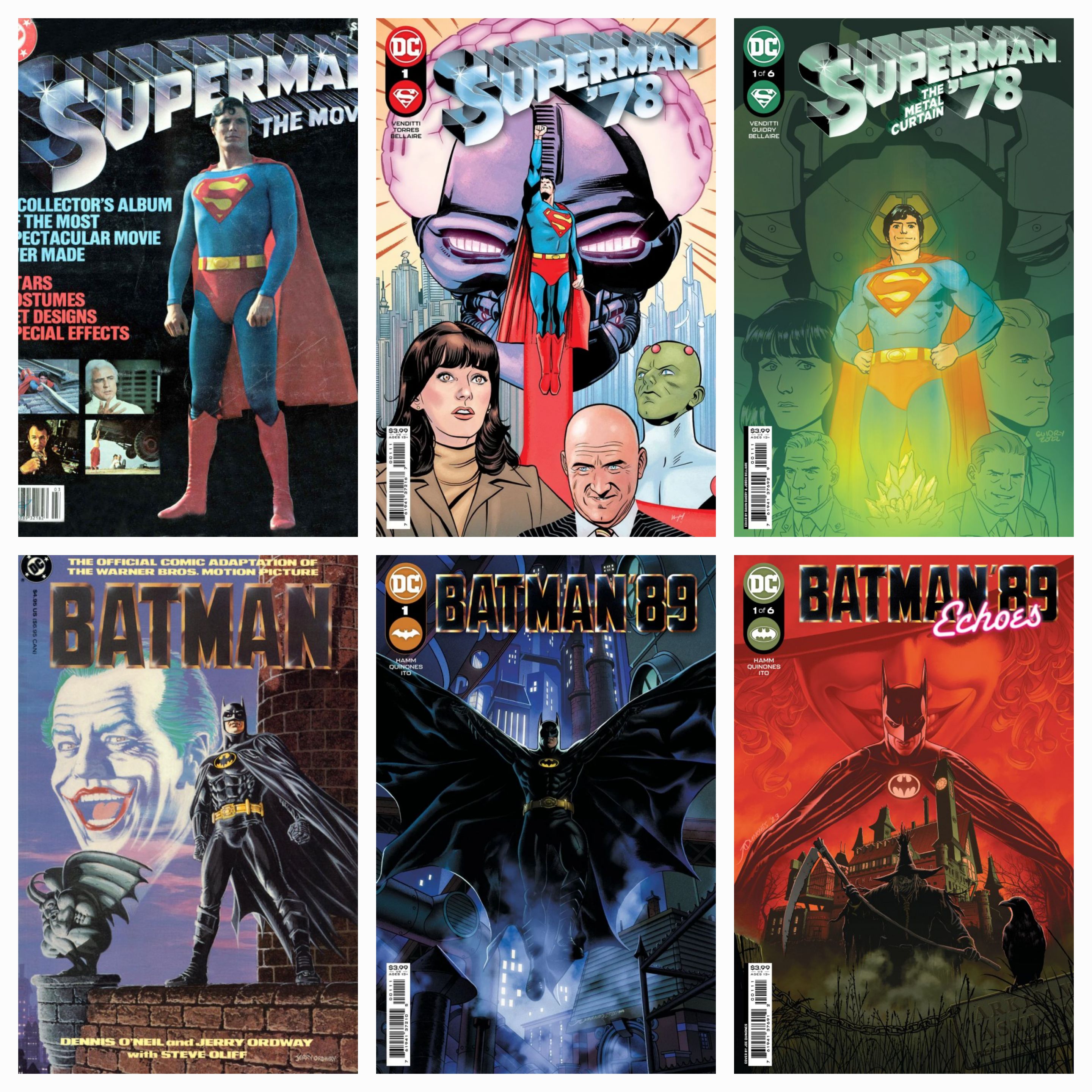
DC Comics: Earth-789
A few years ago, during one of those periodic restructurings of the DC Multiverse, DC announced that the first two Christopher Reeve Superman movies and the Michael Keaton Batman films were canonically part of the same world in their multiverse, which they declared Earth-789. They followed this up with two miniseries under the banners Superman ‘78 and Batman ‘89. (The release years of the movies, obviously – get where the multiverse designation came from now?)
Although the Batman miniseries were egregiously delayed for reasons that were never adequately explained, they weren’t bad. And the two Superman miniseries were GREAT. For their Compact Comics volumes, I would include both miniseries (12 issues total) in one book. But I wouldn’t stop there. All of the movies in these series also received comic book adaptations, so I would begin the Superman volume with the DC adaptations of Superman: The Movie and Superman II, and the Batman book with their adaptations of Batman and Batman Returns.
The other two films in each series aren’t considered canon to Earth-798, but once these two books prove to be the sales colossus we all know they would be, there could be further collections that include the adaptations of those, as well as other ancillary books like the Supergirl adaptation, the Superman Returns prequels, or the spin-off books focusing on the villains from Batman and Robin. There are also sporadic comics set in the worlds of Christopher Nolan’s Dark Knight trilogy and the Snyderverse that could theoretically be included somewhere in there, but honestly, I’m most interested in the Earth-789 stuff. Not just because it’s good, but because DC seems to have cooled on the idea of doing more stories set in this universe, and that’s a dang shame. There’s so much potential to be had there, and I would love to see them bring those characters together officially for the first time along with the John Wesley Shipp Flash, Lynda Carter Wonder Woman, and Helen Slater Supergirl to create a Justice League for that universe. They even included Hal Jordan in the second Superman ‘78 miniseries (artist Gavin Guidry modeled him on Kurt Russell as a nice little bit of “casting”), giving them a chance to expand.
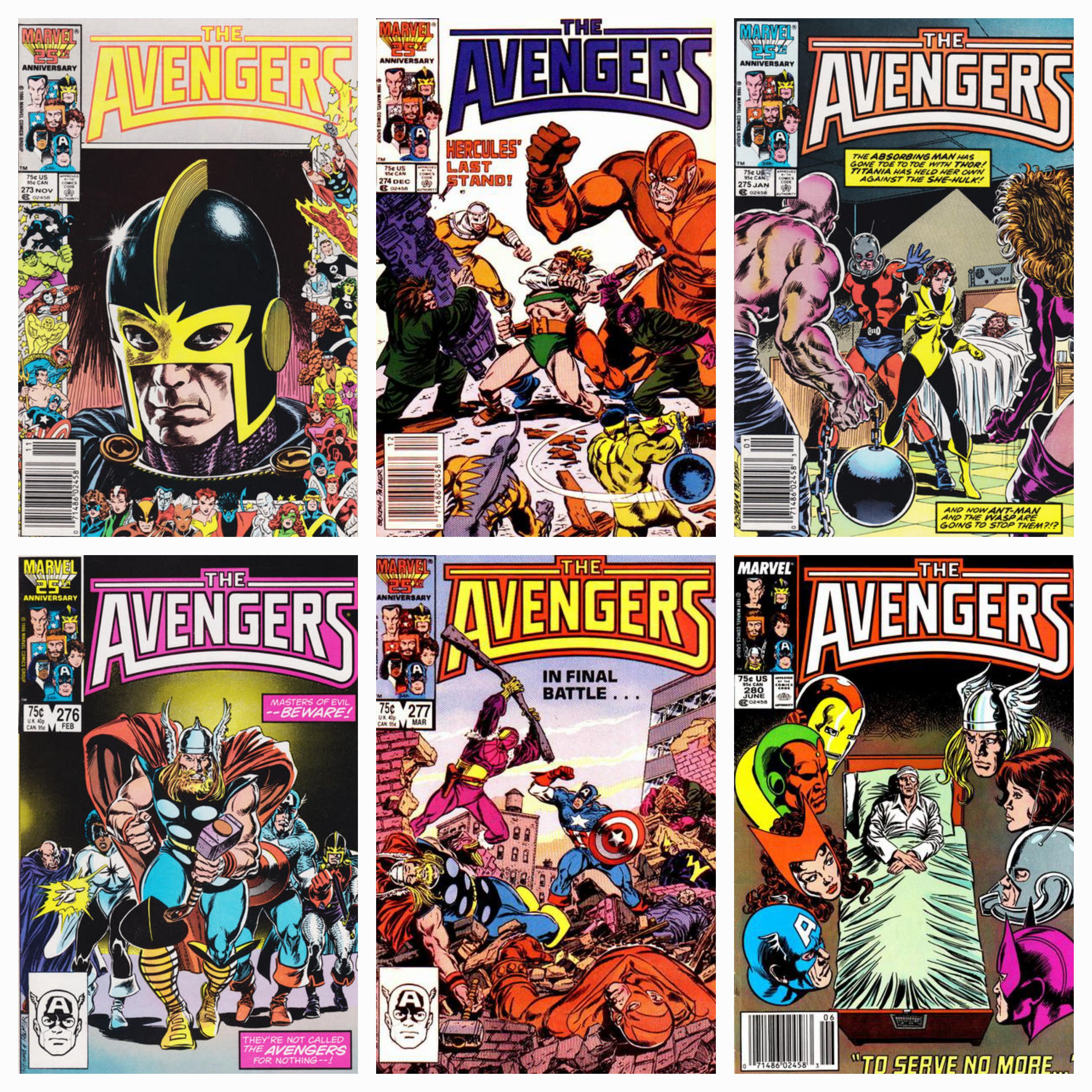
Marvel Comics: Avengers Under Siege
Although most of the Marvel Premier Editions have focused on more recent storylines (by which I mean comics that were published in this century, as opposed to stuff from the era in which I grew up), there’s an Avengers storyline that has always been one of my favorites and deserves the deluxe treatment. In 1986, writer Roger Stern and artist John Buscema wove a nearly year-long story in which the Avengers were infiltrated in their own home, the Avengers mansion, by Baron Zemo’s Masters of Evil. Although the villains had fought – and been bested by – the Avengers time and time again, this attack on their home was a new level of evil, and was one of the first mainstream comics I ever read that showed true, harsh consequences to being a superhero. (It should be noted that I was nine years old when this came out and hadn’t read stuff like the Death of Gwen Stacy yet.)
The story ran through Avengers #270-277, beginning with a subplot in the first few issues as the Avengers went about other business. But things really hit a boiling point in issue #273 when the villains actually broke into the mansion and beat Jarvis, the Avengers’ butler, within an inch of his life. This wasn’t a case of a hero being wounded in battle (although that would happen later in the arc with Hercules), but one of their ancillary characters almost dying because of their proximity to the heroes. Stern used Jarvis to really raise the stakes, wiping away any confidence the reader might have that the Avengers would waltz in and have an easy victory. Over the next four issues, the villains completely destroyed the mansion and nearly killed several Avengers before the heroes finally came out on top, but at no point did their victory feel like a foregone conclusion. That’s a hard trick to pull off in a mainstream comic book, a legitimate feeling of MENACE, but Stern did it.
This story has been collected twice before, in a 1998 trade paperback and a 2010 hardcover, but neither is in print anymore. It’s a great story that should find a new audience. And a Premier edition book would give them a chance to correct an oversight they made with the first two collections, both of which omitted issue #280. This was a sort of epilogue featuring a hospital-laden Jarvis thinking about his years with the Avengers and pondering his future. It belongs in the collection too, folks.
The three remaining companies that have gotten into this game – Oni Press, IDW, and Boom! Studios – each give me a bit of a quandary. You see, in all three cases, these are publishers that are built on a combination of licensed properties (things like Rick and Morty, Godzilla, or Power Rangers) and books that are owned or co-owned by their creators, rather than being the property of the publisher. There’s no “Oni Universe” like there is at Marvel or DC, and with licensing being what it is, it can sometimes be difficult to determine exactly what comics these publishers currently own the rights to, unless it’s something that’s been published recently. Let’s take them one at a time.
Oni Press
So far, Oni has published or scheduled six of their own “Compact Comics,” all of them connected to either their licenses for the cartoons Rick and Morty or Adventure Time. Earlier this year, however, they announced an upcoming partnership with Archie Comics, and they’re going to publish some of Archie’s “New Riverdale” era in the compact format as well. (This came up in the aforementioned Geek Punditry #164). So besides extending these existing licenses, which Oni comics are deserving of the Compact treatment?
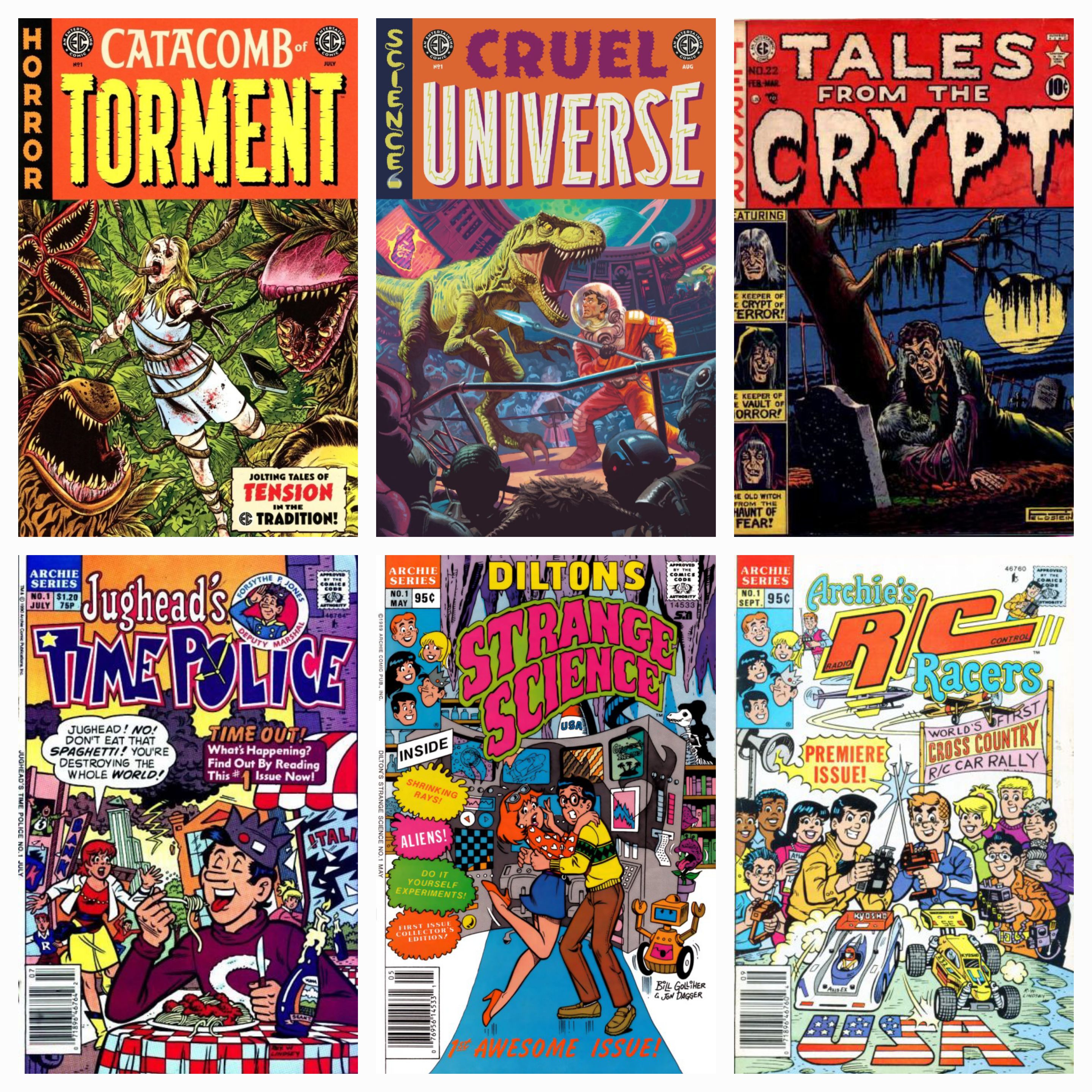
EC Comics. In recent years, Oni has become the new home of the classic publisher EC Comics, the company that gave us the likes of Tales From the Crypt and Weird Science. Oddly, though, rather than continuing those brands (I don’t know why — I would guess some sort of licensing kerfuffle), Oni is using the EC label and style for new, original titles such as Cruel Universe, Catacomb of Torment, and Blood Type. These books – horror comics or a horror/sci-fi blend – have been in production long enough to have built a decent-sized back catalogue, and it would do well to release those in compact form. And if possible, I would also love to see them reprint the classic EC stuff as well, especially the original Tales From the Crypt and its sister comics Vault of Terror and Haunt of Fear.
Since Oni is going to be handling the Archie compacts as well, here’s a bonus suggestion for them: besides just reprinting the “new Riverdale” stuff, and beyond giving us reprints of the Archie classics, I’d like to see them use this format for some of the weirder books in Archie’s catalogue. Their various versions of the Red Circle/Mighty Crusaders superheroes over the years, for example. Or even better, let’s look at the 90s – that was an era when Archie experimented with a lot of new titles with weird hooks. Veronica. Jughead’s Time Police. Dilton’s Strange Science. Jughead’s Pal Hot Dog. Archie’s R/C Racers. Jughead’s Diner. There was a lot of Jughead in these books. And while sadly none of these lasted more than a year (except for Veronica, which started as a book about her travelling to a different country in each issue, then dropped that hook and just became a straightforward Veronica comic), I think they were ahead of their time. There were a lot of stories in those books that I remember fondly, and I’d love to see a Compact Comics edition of some of these.
IDW Publishing
Of these three latecomers, IDW has already done the most with their line, with a book each for licensed properties Godzilla and Teenage Mutant Ninja Turtles, two volumes of The Rocketeer, and a whopping five collections of their various Star Trek series. They’ve also got one book each for their original series The October Faction and D4VE, and two volumes of what is arguably their flagship original property, Joe Hill’s horror/fantasy epic Locke and Key. Assuming that these series will continue (as they should), let’s dip into their existing catalogue to see what could be added.
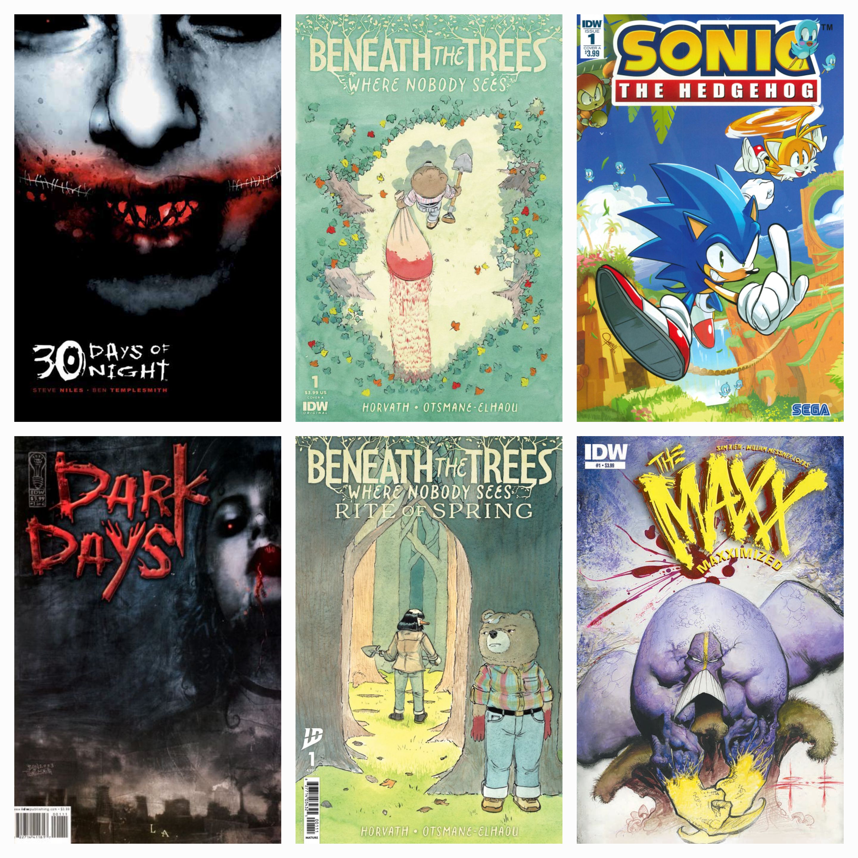
Before Locke and Key, the most famous original title published by IDW was probably Steve Niles’ vampire saga 30 Days of Night. The comic – about a town in Alaska where the sun sets for a solid month, making it a virtual buffet for a clan of hungry vampires – was really big in its day, spawning countless sequels, spin-offs, and a movie franchise. The Compact Com–I’m sorry, the “IDW Classic Collection” treatment would be a perfect place for the series to come back and find a whole new audience of readers that came up since the original series was in its heyday.
IDW is also home for the more recent hit Beneath the Trees Where Nobody Sees, a surrealistic serial killer saga by Patrick Horvath. The story, about a psychotic teddy bear whose careful cover is threatened when a second serial killer begins to strike victims in her home town, has garnered a legion of fans and there are most certainly more volumes in the works. A Classic Collection of the first two series seems like a no-brainer.
As far as IDW’s many licensed properties, some of the ones that helped build the company in the early 00s and 10s have moved on to other publishers (things like G.I. Joe, Transformers, and Ghostbusters), so those are off the table. However, IDW snatched Sonic the Hedgehog from Archie almost 10 years ago and have had a very successful run, with the main title closing in on 100 issues and plenty of spin-offs to go around. A Classic Collection of that series would do very well.
IDW was also the most recent publisher of Sam Kieth’s surrealistic superhero The Maxx. Kieth’s comic was originally published by Image, but a few years ago IDW published a remastered series (Maxximized, they called it) with more modern coloring. The book was lovely, and with Kieth sadly passing away a few months ago, I think a Classics Collection – three volumes should be enough for the entire main series – would be a good tribute to his work, much like their Rocketeer books stand sentinel for the late Dave Stevens.
Boom! Studios
The newest kid on the mini-comic block is Boom! Studios. None of their Compact Comics have even been released yet, with the first scheduled for September. Of those that have been announced, there are two volumes of their popular Mighty Morphin Power Rangers license and a one-volume collection of Victor LaVelle and Jo Mi-Gyeong’s post-apocalyptic fable Eve.
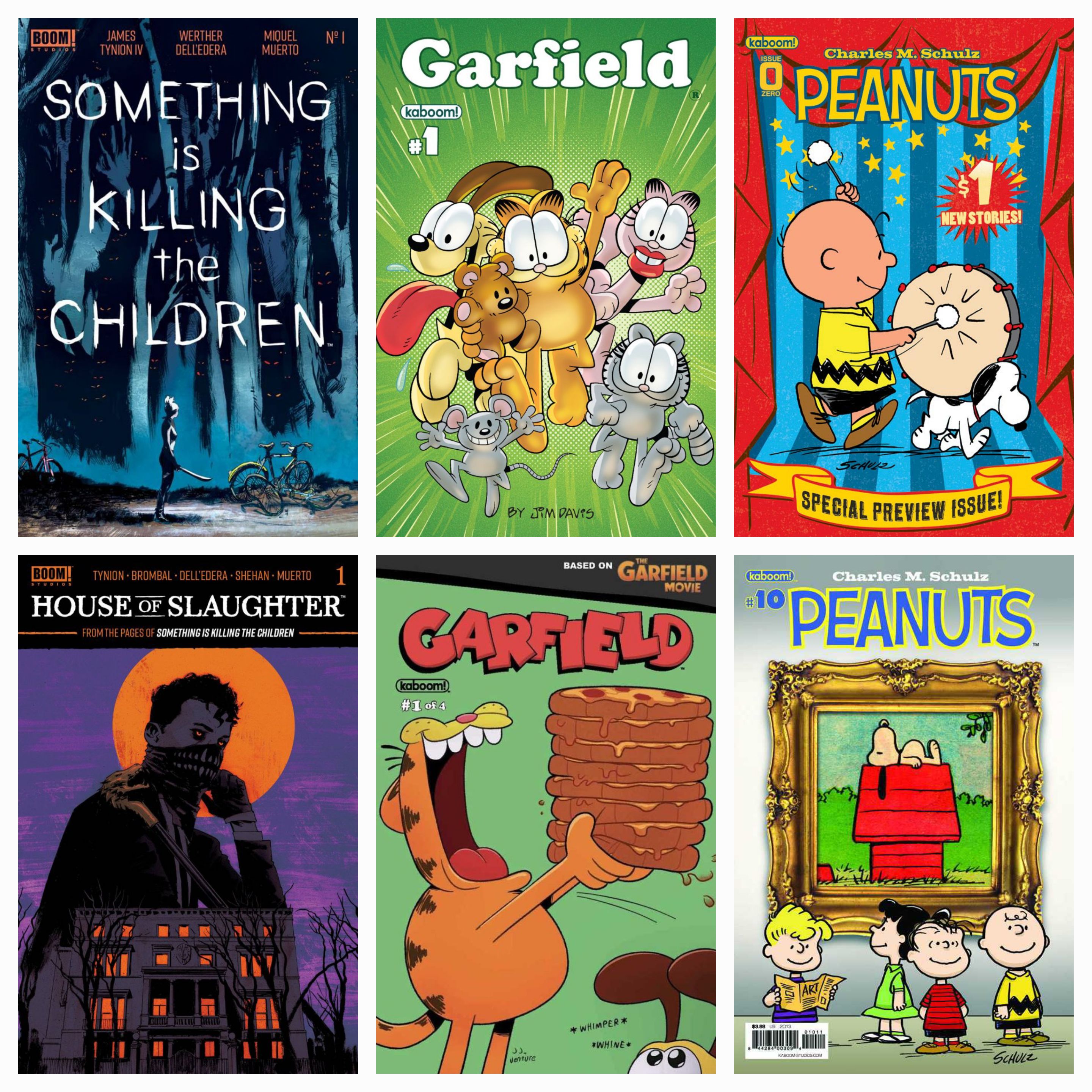
I would suggest for Boom! (and to be fair, odds are that SOMEBODY there has already brought this up) that they continue the line with James Tynion’s mega-hit Something is Killing the Children and its spin-off title House of Slaughter. SIKTC is about a small town where children are disappearing. Most aren’t found, and those that DO come back do so with tales of horrors beyond imagining. A stranger named Erica Slaughter appears in town, preparing to fight against the evil that’s engulfing it. The book is scheduled to hit its 50th issue later this year, so there’s plenty of story to share. House ofSlaughter, meanwhile, is about the mysterious organization that turned Erica into a monster-hunter. This one lasted for 30 issues, with a new follow-up series, Fall of the House of Slaughter, currently in publication. This is probably Boom!’s crown jewel these days, and they’d be well-advised to Compact ‘em.
As far as their licensed properties go, Boom! has a similar problem as IDW, as many of the licenses they were built on have ended. However, they have a long-standing license to produce comics starring Jim Davis’ legendary fat cat Garfield, with a series that lasted for 36 issues and dozens of spin-off one-shots and miniseries, including a tie-in to last year’s movie and a Baby Garfield miniseries currently on the stands. There’s more than enough content for four or five Garfield collections. And let’s face it, Jim Davis has never met a licensing opportunity he didn’t like. Similarly to Garfield, Boom! also had a long run of comics based on Charles M. Schulz’s Peanuts, including an ongoing, a few mini-series, and several original graphic novels. I’d love to have these collected as well, but the most recent Peanuts book from Boom! came out in 2021, and I’m not certain if they still own the license or not. If they do, they should get on it.
There you have it, folks, five publishers and tons of suggestions for books they should add to their rapidly-growing library of smaller-scale comic book collections. I obviously love this format, and I welcome any and all books that can be added to it, but these are some of the ones that I think are really deserving of the treatment.
Blake M. Petit is a writer, teacher, and dad from Ama, Louisiana. His most recent writing project is the superhero adventure series Other People’s Heroes: Little Stars, volume one of which is now available on Amazon. He’s also started putting his LitReel videos on TikTok. He’s going to go over there on the bench now and stare hard at Image, Dark Horse, and Dynamite Entertainment until they start doing their own Compact lines to go along with everybody else.
It’s the end of the school year, and as a teacher, that means that I’m hip-deep in data and swimming in a pool of number crunching, which wouldn’t be so bad if it wasn’t for the fact that I teach English specifically to avoid math. But as such, I’ve got my hands full, so let’s have just a quick chat in this week’s Geek Punditry, shall we?
Earlier this week, I was sent an invitation to participate in a survey regarding DC Comics’ Absolute Universe. It seems a little silly to make that the focus of any serious scrutiny, as they’re currently selling comics faster than Taylor Swift could sell out a 75-seat Black Box theater, but I’m always happy to share my two cents. It’s actually the last question in the survey that got me thinking today: they asked the ever-classic, open-ended, “Is there anything else about DC Comics or the Absolute Universe you would like us to know?”
Seriously, does this seem like a program that requires notes of any kind?
Now, I have no illusions that my words will actually make it to the ears of the people who have the power to do anything. I honestly would be surprised if they make it to human ears at all – I’ve got a horrible suspicion that these surveys are crunched by some AI algorithm that summarizes the responses and hallucinates an added suggestion that Superman’s mermaid ex-girlfriend Lori Lemaris should start dating Detective Chimp, which I’m pretty sure would be illegal in at least 17 states. But I thought about it anyway, and I told ‘em what I think is the biggest problem I have at the moment with DC – a company that is currently on a wild upswing that I’ve been enjoying very much.
Where’s the DC Universe stuff for the kids?
People who don’t read comic books regularly may find this question surprising. After all, aren’t superheroes inherently for kids? And the answer is, no, they’re not, especially since 1985. Sure, since in the early days of the genre, children have been attracted to superhero comics, but although there have been certain specific titles geared towards them, the genre as a whole has largely targeted a broader audience. Then, as that audience aged, so did the genre’s target. The result is that the DC Universe doesn’t currently have any regular comics that are appropriate for a younger audience.
Okay, I guess there’s ONE.
This problem isn’t exclusive to DC by any means – Marvel, Image, none of the major players really have a ton of stuff in their main line that’s child-friendly. And that’s not to say that there are no DC Comics for younger readers. There’s a robust line of Young Adult graphic novels, and other books geared towards children. If my 8-year-old son came up and asked me to read a Superman comic book, I could get Rob Justus’s charming Superman’s Good Guy Gang and give it to him. And my oldest niece, who was just at the right age to get into the DC Super Hero Girls when they first hit about a decade ago, is also at the right age for the upcoming DC Super Hero Girls Class Reunion graphic novel they’re about to drop, as well as dozens of other solid books. There’s stuff out there.
But the vast majority of them are not part of the DC Universe proper. Books like these aren’t part of the tapestry of the story that’s been unravelling across the pages of the monthly Superman, Justice League, Green Lantern, Flash, Batman, and Wonder Woman titles for the past couple of years now. These graphic novels are good introductions to the characters, but it’s not quite as easy for these young readers to find a way into the world, because by and large the main DC books aren’t being written for them. That may seem insignificant, but I think it matters. Readers may pick up an original graphic novel, but that attachment to the larger narrative makes it feel like books have consequence. Even the Absolute Universe probably wouldn’t be as popular if the titles were all self-contained, but they are specifically earmarked as their own universe, which is interacting (slowly but surely) with the main DCU through their multiverse. That matters.
Even the comics about younger characters don’t feel like they’re being aimed at younger readers. The current New Titans run is only two issues deep, but it’s full of time travel and mind manipulation and other things that would confuse the heck out of a younger kid trying to read it. Firestorm is one of DC’s younger heroes (in terms of the characters’ age in-universe, although he’s been around since the late 70s), and while his new series started off with a bang, it’s the kind of bang that makes it clear this is a series that’s going to delve into deep psychological issues regarding power and trauma, and that’s not what I’m looking for here.
Nuclear holocausts make for great playground reading.
Marvel has the same trouble, but the way. If you pick up recent issues of Miles Morales: Spider-Man (probably the youngest character with his own title) you’d get a lot of dense stories and characters that would push away a newcomer. Even Gail Simone’s excellent Uncanny X-Men, which features Rogue leading a team of veteran X-Men as they try to shepherd a group of new teenage mutants just coming into their powers, is a great book for an audience of teens and above. But there’s nothing “below” that comes from the main Marvel Universe any more than DC.
And look, none of this is to complain about any of the books that I’ve mentioned. I certainly don’t think Gail Simone should shift her focus to make a book that’s appropriate for 8-year-olds, and doing such a thing with the Absolute Universe would be like finding a machine that dispenses unlimited chicken nuggets and then kicking it to pieces because it doesn’t also give you french fries. I need to stop writing these columns before lunch. I’m just saying that I wish there were more comics in addition to those that I could share with the likes of my son, my nieces and nephews, or students.
FOR EXAMPLE…
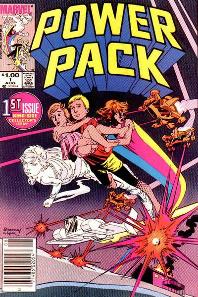
In the 80s, one of Marvel’s most acclaimed (if not best-selling) comics was Power Pack by Louise Simonson and June Brigman, then later Jon Bogdanove. It was a book about a group of four brothers and sisters – actual children, I think the oldest was around 12 when the series started – who were given powers by a dying alien to help save Earth from an invader. Once the job was done, they kept the powers and became superheroes. This book hit almost EXACTLY at the same time that I started reading comic books, and it quickly became a favorite of mine. It still is, honestly, because Simonson had an astonishing talent for writing characters who felt, behaved, and talked like actual children, while at the same time, demonstrating true courage and heroism. And it was firmly entrenched in the Marvel Universe, with the kids frequently running into the likes of Spider-Man and the X-Men, even inviting Wolverine and Kitty Pryde to their house for Thanksgiving. Later in the run, the kids added Franklin Richards – son of Reed and Sue of the Fantastic Four – as an official member of the team. They even participated in crossover events like Secret Wars II and occasionally guest star in other titles, just like real superheroes do.
And I think it’s important to note that Power Pack was about children, but it wasn’t exclusively FOR children. Even at the time, adult readers enjoyed it quite a bit, with it being nominated for awards and placed on lots of “best of the year” lists for the first few years of the run. But that acclaim didn’t come at the expense of telling a story that kids COULD enjoy.
It’s been a very long time since there was a comic book series that fit that description that was set in one of the mainstream shared comic book universes.
And with comics on an upswing – a wonderful, glorious upswing – wouldn’t this be a great time to put out some stuff that opens doors at the beginning of the reading spectrum instead of just having stuff for those of us who have been reading for a while?
Blake M. Petit is a writer, teacher, and dad from Ama, Louisiana. His most recent writing project is the superhero adventure series Other People’s Heroes: Little Stars, volume one of which is now available on Amazon. He’s also started putting his LitReel videos on TikTok. Something something Captain Carrot.
It’s time again, friends – the crossover gods have descended upon us for the second of the two crossover specials featuring the Man of Tomorrow and the Friendly Neighborhood Arachnid. And I almost hate to say it, but this one may even be better than the first.
Marvel/DC: Superman/Spider-Man #1
Main Cover: Pepe Larraz. Like the last one, though, this issue was released with over forty different covers, which is absolutely absurd, but I once again would totally be willing to buy a special that collected all of the various covers of the two volumes. Maybe a charity special or something? Pay attention, people.
In the first book in this series, Mark Waid gave us a tale of a Superman and Spider-Man who were clearly old friends. This issue seems to greet the two of them relatively early in their association, picking up in the middle of a story that has trapped the two of them in a building collapse that includes a dose of Kryptonite, forcing Spider-Man to try to keep them alive as Superman struggles against the radiation.
And that’s just how it starts.
The story, ostensibly, is about the two heroes in combat with their respective arch-foes, Lex Luthor and the Green Goblin. But honestly the identity of the villains couldn’t matter less. The bulk of the story is built up around these two heroes trapped together in a harrowing situation and just…talking. Getting to know one another. Learning who each other are. The supervillain plot wraps up with several pages left, and we follow Clark and Peter into their respective civilian lives as well, including a final sequence that should touch the hearts of anybody who loves these two characters.
Meltzer knows Superman so incredibly well, and the way he plays Superman’s strengths into Spider-Man’s inherent insecurities builds up BOTH characters and makes them better, stronger, and more inspiring. I’ve seen articles online drooling over a few panels where the Venom symbiote snares Superman as if that’s what this story is about. It’s a perfectly good sequence, but Peter taking his Aunt May for dinner at the Kent farm is where the soul of this story is, and that soul is utterly beautiful.
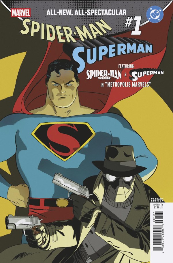
Title: Spider-Man Noir and Superman in “Metropolis Marvels Writer: Dan Slott Pencils: Marcos Martin
The first backup in this issue dives into the world of Spider-Man Noir, where the friendly fedora’d webslinger is targeting the kingpin of crime: Lex Luthor. But Noir’s more violent tactics bring him into conflict with a Superman pulled from the pages of Fleischer cartoons. The story is fun, and Martin’s artwork is fantastic (especially a page where Superman ‘38 gives us a quick homage to Amazing Fantasy #15), but as turned out to be the case with many of these back-ups, it was over too quickly and felt somewhat rushed.
Title: Gwen Stacy and Lana Lang in “Sweethearts” Writer: Joe Kelly Art: Humberto Ramos
A college-age Lana Lang and Gwen Stacy meet up on campus and strike up a quick friendship, fueled at least in part as the two of them talk about the mysterious goody two-shoes men in their lives that they just can’t seem to shake. This bite-size story is actually pretty perfect, showing the two women as foils to one another in a way that feels surprisingly natural. There have been many different incarnations of Lana Lang over the years, and Kelly seems to have created one who’s kind of a gestalt of different ones. She’s not the nosey mini-Lois that plagued Superboy in the Silver Age, nor is she the tragic, heartbroken wreck that John Byrne left behind, but rather a woman who is strong enough in her own right but still besmitten with the boy back home. Gwen, on the other hand, is pretty much Gwen, although (thankfully) not the angelic simulacrum that many contemporary writers have cast her as. The knowledge that each of these women are in doomed relationships – doomed for very different reasons but doomed nonetheless – gives the whole story a bittersweet edge that concludes things on a note of joy that is tempered by the fact that the reader knows it won’t last.
Title: The Thing and Superman in “Identity War” Writer: Geoff Johns Artist: Gary Frank
Frequent collaborators Geoff Johns and Gary Frank reunite for this story in which Mysterio has teamed with the Legion of Super-Villains and, using the power of a Red Lantern, set the Hulk out on a rampage fueled by even greater rage than he’s ever felt before. But that isn’t what this story is about. It’s actually about the Thing, one of the few people immune to the rage that is infecting the world, watching Superman tussle with his frequent green-skinned sparring partner and seeing how he handles the situation in a very, very different way than Ben ever would.
The description, I admit, doesn’t sound that exciting, but this story is a masterpiece of character work. Johns knows Superman, obviously, but casting him in this story is just perfect. The story about rage and division is a clear allegory for the real world, but Johns pulls it off without getting heavy-handed or pointing fingers, but rather by using Ben Grimm to draw conclusions that far too many people in the real world need to understand.
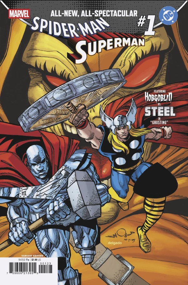
Title: Hobgoblin Vs. Steel in “Ghosting!” Writer: Louise Simonson Art: Todd Nauck
Steel’s co-creator Louise Simonson gives us this quick tale about him going into battle against the Hobgoblin, with a special surprise guest that’s wonderfully appropriate. But like the aforementioned Slott/Martin story, this feels rushed and over too quickly. Great art by Todd Nauck, and I would love to see him draw Steel more often, but it left me wanting more.
Title: Ghost-Spider and Supergirl in “Remarkable” Writer: Stephanie Phillips Art: Phil Noto
Ghost-Spider visits Metropolis only to find herself teaming up with Supergirl in combat with Live Wire. It would be a great team-up, if only Supergirl had any idea who she was. This is a really funny little story, and a strong character piece from Phillips (who has a lot of experience writing Gwen, but does a dandy Supergirl as well). This story really works well with the short format. In fact, I find that for the most part the stronger backup stories in this issue are the ones that tell a quick character study of the two characters rather than the ones that try to squeeze in an adventure in the limited page count.
Title: Miles Morales, Spider-Man and Superman in “The One Thing…” Writer: Brian Michael Bendis Art: Sara Pichelli
Miles Morales’ creators reunite for this one, in which Mile sees something crash to the Earth, only to find Superman trapped by a strange alien artifact. This story tries to split the difference between character piece and adventure story. It ends on a kind of cliffhanger (not unlike the Superboy/Spider-Man 2099 story from the previous book), but in the middle we get Superman talking to Miles and sort of propping him up as a hero. It’s not bad, and that’s coming from someone who didn’t like any of Bendis’s Superman run, but it also covers a lot of the same ground that the Meltzer story does at the beginning of the issue, only better. I feel like this was a wasted opportunity, honestly – it may have been more interesting to see Bendis write Miles and Jonathan dealing with legacy.
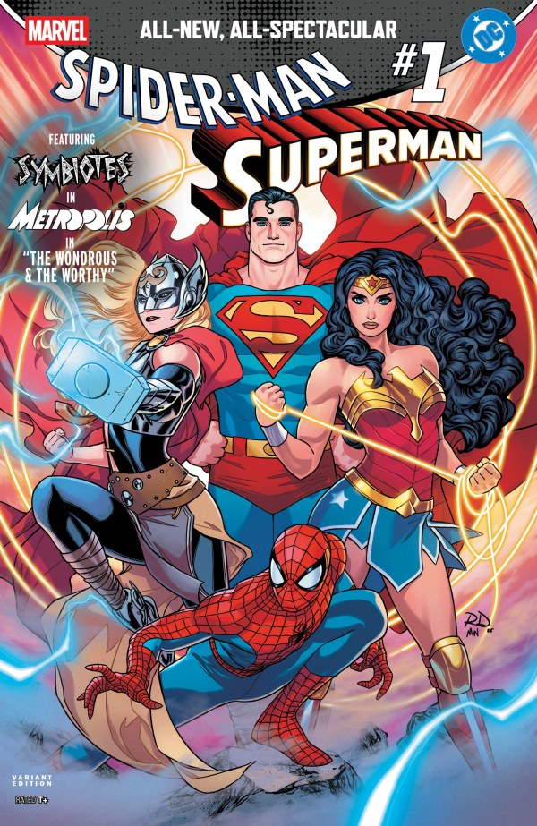
Title: Thor and Wonder Woman in “The Wondrous and the Worthy” Writer: Jason Aaron Art: Russell Dauterman
Jason Aaron, the writer behind the Jane Foster era of Thor, returns to that version of the character for this story. The most interesting thing about this one, honestly, is the setting. Aaron seems to be placing this story as an encounter between the two heroes in the midst of the War of the Realms event Aaron wrote back in 2019. In this version, however, it looks like Darkseid and the New Gods were tossed into the mix as well. It’s another “inexperienced hero gets a boost from the older one” story, and while I’m curious about the backstory, the character stuff feels a little incomplete.
Title: Spider-Man and Superman in “One of Those Days” Writer: Jeph Loeb Art: Jim Cheung
Loeb and Cheung wrap up this issue with a two-pager of…well, it’s Superman giving Spider-Man a pep talk again. It’s fine for what it is, really, but we get a LOT of that kind of thing in this book. I’m all for Loeb and Cheung doing a quickie about the two heroes, but it feels like the editors should have kept a closer eye on the back-ups to make sure they weren’t all retreating the same ground.
To be fair, I loved this issue. The main story and the Johns story are both without peer. The Gwen/Lana and Gwen (the other one)/Kara stories are both excellent. The rest range between “good” and “would be better if it wasn’t the same thing we’ve already read.” But the thing I’m taking away from this is that there’s so much ground to cover in bringing these characters and their respective worlds together. These two one-shots, wonderful as they are, only seem to hint at a larger connection that I would love to explore.
Marvel. DC. There is so much ground to cover here. Don’t wait another 50 years before you do this again.
Blake M. Petit is a writer, teacher, and dad from Ama, Louisiana. His most recent writing project is the superhero adventure series Other People’s Heroes: Little Stars, volume one of which is now available on Amazon. Don’t forget, you can check out earlier blogs in the Year of Superman/Superman Stuff Archive! Got a request for a future “Superman Stuff”? Drop it in the comments!
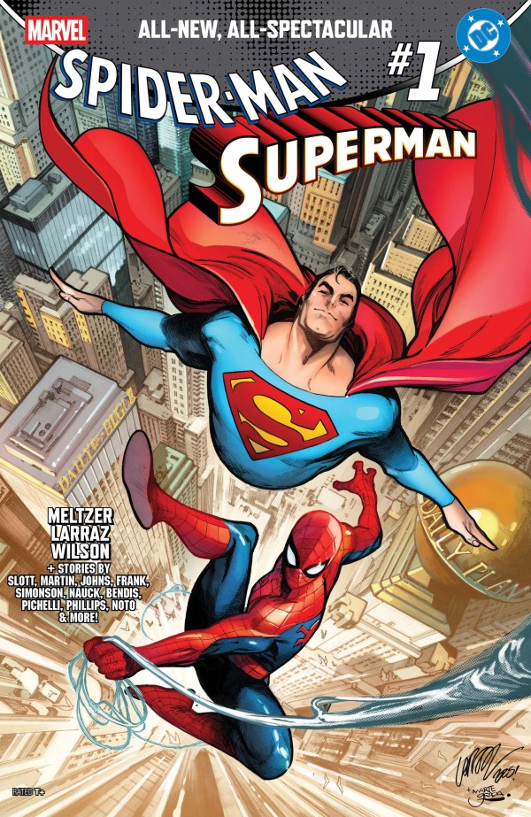
At last, the time has come! After months of waiting, DC Comics blessed us this week with the first of the two crossover books featuring Superman and Spider-Man, and as promised, there’s a bounty of back-up stories as well. As with any anthology, some of the stories are better than others, so this time out I’m going to give you my thoughts on each of them.
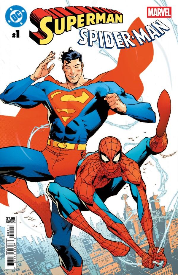
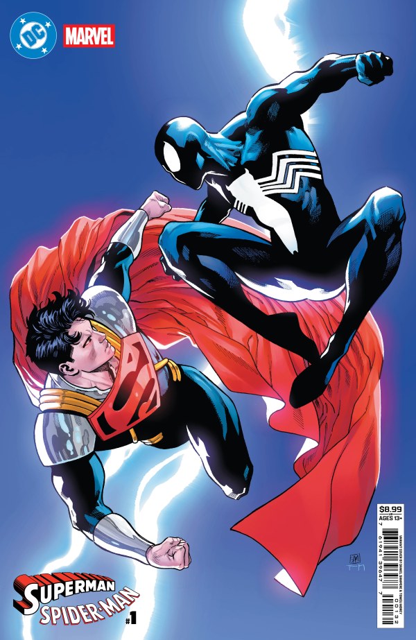
DC/Marvel: Superman/Spider-Man #1 Main Cover: Jorge Jimenez, although it should be noted that there are – at current count – FORTY-ONE different covers to this book, and while I’m absolutely NOT gonna shell out $8 a copy for all of them, if DC and Marvel put out a special that collected all of the various covers from this book and the Marvel book coming out in a couple of months, I would 100 percent purchase it.
Title: Truth, Justice, and Great Responsibility Writer: Mark Waid Art: Jorge Jimenez
In our main story this issue, Dr. Octopus is messing around with an AI assistant that turns out to be Superman’s old foe Brainiac, which just goes to show you that using ChatGPT is just bad news. Clark Kent and Peter Parker, meanwhile, are working together on a story about the theft of some radioactive materials…including Kryptonite.
Mark Waid does something truly unique with this story. In the universe he’s created here, he presupposes that Superman and Spider-Man – and more specifically, Clark and Peter, have a history together. And I don’t just mean the previous crossovers between the two that have happened in the past (all of which are decades old). No, reading this book you get a clear feeling that this is an incarnation of DC and Marvel’s respective flagship characters that have had a great number of adventures together that we, the reader, have not been privy to. Most crossovers start with the characters meeting each other for the first time. If we’re lucky, they’re at least aware of the others’ existence, but they’ve never encountered each other before. This book instead implies a whole shared existence between the two that feels so fresh and so RIGHT, and makes me wish there were more stories coming beyond just the Marvel book.
Like seriously. DC. Marvel. Get Waid working on a 12-issue maxiseries showing the entire history of this Multiple World’s Finest duo, like YESTERDAY.
Jorge Jimenez on the art is the icing on the cake. He’s got a great take on each of our heroes and both of our villains. The story looks as good as it reads. The lead story is a home run.
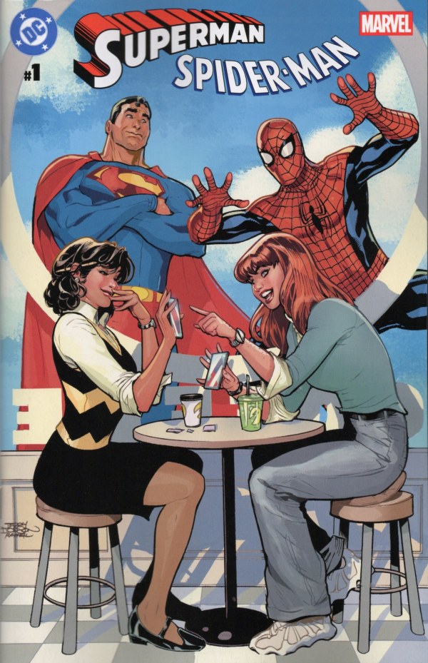
Title: Lois & Mary Jane in “The World’s Finest” Writer: Tom King Pencils: Jim Lee Inks: Scott Williams
Tom King’s Lois and Mary Jane story is next, and this is an interesting one. As Superman and Spider-Man duke it out with a rogue Sentinel (is there any other kind?), Lois and MJ go about a sort of casual conversation amongst the chaos about what it means to be them, the women in the lives of two of the world’s greatest heroes. It’s a really interesting way to frame these two, using their unique shared perspective in a way that wouldn’t really work with any other two women in comics. Using the backdrop of the Sentinel fight instead of just having them meet for lunch or something (as they do on the Terry Dodson variant cover) gives it a different flavor that makes it feel more unique. I feel like this one is intended to be in continuity with Waid’s story, and if that means this shared universe is one where Pete and Mary Jane are still together, I want more stories set in this universe even MORE.
Title: Superboy-Prime and Spider-Man in “Pages” Writer: Christopher Priest Art: Daniel Sampere
I really wasn’t sure what to expect out of this pairing. We’ve often seen Superboy-Prime using his knowledge of DC Comics (coming from a universe where those are all fictional) to navigate his world on more than one occasion. Christopher Priest here supposes that if DC Comics are fictional to Prime, it stands to reason that Marvel is too. (And I suppose every other publisher, by extension, but let’s just stick to Marvel now.) Prime uses his ability to travel the Multiverse to move back in time to a point in Marvel’s history shortly after Peter Parker got rid of his symbiote costume, when he was wearing a black suit made out of traditional fabric, and the confrontation between the two of them seems to unlock something in the boy.
Prime has been on something of a redemption arc in the comics as of late. This story actually feels like it could be the beginning of that, as if it logically should take place prior to his appearance in recent issues of DC KO. I have to admit, for a kid who modeled himself on Superman and stumbled so badly, I kind of like the idea of an encounter with Spider-Man being the thing that sets him back on the right path.
Title: Superboy and Spider-Man 2099 in “Beyond the Cobwebs of Tomorrow” Writer & Artist: Sean Murphy
Miguel O’Hara, Spider-Man 2099, is on the run. I know, what else is new? But as he flees from the authorities, we realize that he’s not in the 2099 that we’re used to, not exactly, and that idea is driven home even harder by the sudden appearance of a time-tossed Superboy and a special guest star. As our heroes compare notes, they come to realize the real threat they face and…
…and that’s it. The story ends with the team-up forged and our heroes barrelling off to take care of business. But the problem is, that isn’t really a story. This is, if anything, the first CHAPTER of a story, and an incomplete chapter at that. I get that these backups have a pretty limited number of pages, but this whole sequence comes across as a tease of something that I really want to read. Teasers are only fun, though, if what’s being teased eventually reaches you to be read. Despite a fun team-up and some well-executed pages, this is the first story in the book that I feel is a little bit of a letdown.
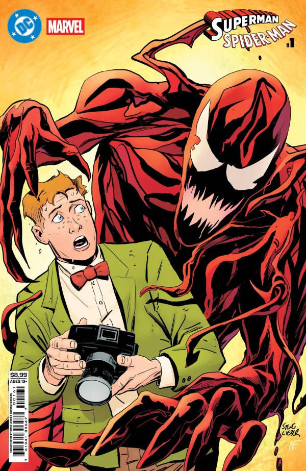
Title: Jimmy Olsen and Carnage in “Jimmy Con Carnage” Writer: Matt Fraction Art: Steve Lieber
Fraction and Lieber, the creative team behind the Superman’s Pal Jimmy Olsen miniseries from a few years back, reunite for the wildest pairing in this book. Jimmy’s meandering has led him to leave Metropolis for New York and get a job as the newest photographer for the Daily Bugle. And like ALL Bugle photographers learn, J. Jonah Jameson has one edict: PICTURES OF SPIDER-MAN. The only problem is that new-to-town Jimmy doesn’t even know what Spider-Man looks like. Doesn’t even know about the hyphen.
I know these stories are out of continuity, but it’s crazy what they allow Fraction to get away with in this one. It’s crazy, for instance, that Jimmy somehow has never seen one of Peter Parker’s 17 million photographs of Spider-Man. It’s crazy that he thinks Carnage matches the description. It’s crazy the significance that a hyphen plays in this story. It’s hilarious and ridiculous in all the ways that Jimmy’s solo series was, although with a bit more finality.
Title: Jonathan Kent and Ben Parker in “The Bridge” Writer: Jeff Lemire Art: Rafa Sandoval
This story (another one that feels like it belongs in this combined world) is a quick snapshot, Jeff Lemire bringing us a sweet glimpse at the adoptive fathers of our two heroes. A chance meeting, many years ago, brings Ben Parker to Smallville, Kansas just as a massive rainstorm threatens people in town, and Lemire shows us the kind of steel that forged Clark and Peter into the men that they are. Nothing particularly surprising in this one, just a good, simple encounter that feels like a minor but welcome detail in this strange world that they’re building.
Title: Bias Writer: Greg Rucka Art: Nicola Scott
This one, too, feels like a little snapshot. Jack Ryder’s program has a pair of special guests, Lois Lane and Jonah Jameson, on the air debating the concept of media bias. Lois calls Jonah out on his anti-Spider-Man stance, and Jonah responds.
There’s not much else to say about this one, honestly. Like the Lemire story, it feels like a detail added in to populate the world. I appreciate how well Rucka casts each of these characters, up to and including Jonah’s defense for his position on our friendly neighborhood wall-crawler. But it’s again just a tidbit, a nugget of something more.
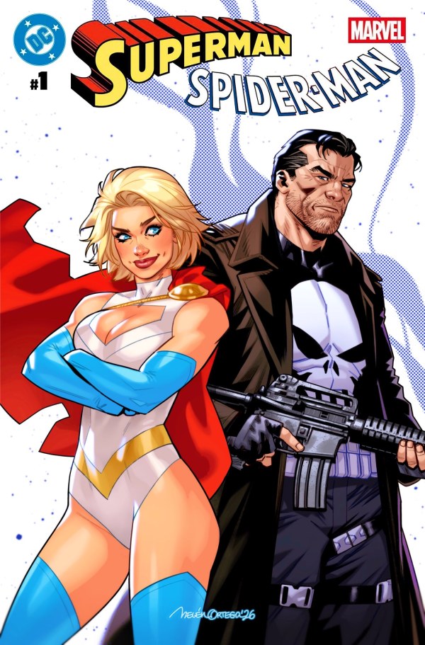
Title: Power Girl and the Punisher in “Blind Date” Writer: Gail Simone Art: Belen Ortega
Of all the pairings in the book, this one may seem the most random, until you remember that both of these characters were created by Gerry Conway, and it seems that Simone thought it would be fun to pay tribute to that. She was, of course, correct about that. In this story, Karen Starr is on her way to a blind date with – well – perhaps the most hated Marvel character of the past half-decade or so. It’s just her bad luck that the restaurant where she’s meeting him happens to be full of criminals that have been targeted by Frank Castle.
As unusual as the team-up is, Simone handles it with her usual humor and charm. Somehow she structures the story in a way that brings them together organically, while still dropping in plenty of meta-commentary about the characters and playing with who they are and just how deeply different they are, while at the same time, having more than a little in common. This may be the most unexpectedly fun story in the book.
Look, I’m not going to pretend that I’m a hard sell. This is a comic book focusing on two of my favorite characters and an all-star collection of creators. It’s a load of fun and it feels oddly as though it’s being used to build towards something larger. (I’m probably wrong about that. I hope I’m not.) At any rate, it was well worth the price, and I can’t wait for Marvel’s half to come in April.
Blake M. Petit is a writer, teacher, and dad from Ama, Louisiana. His most recent writing project is the superhero adventure series Other People’s Heroes: Little Stars, volume one of which is now available on Amazon. Don’t forget, you can check out earlier blogs in the Year of Superman/Superman Stuff Archive! Got a request for a future “Superman Stuff”? Drop it in the comments!
The bidding war is over, and after a protracted tussle over the fate of the grand old movie studio called Warner Bros, the winner – shockingly – seems to be Paramount. Over the last few months we’ve watched as Warner Bros, which of course has expanded far beyond being a movie studio to being a full-blown media empire, was put on the market. We saw it get snapped up by Netflix, we saw as Paramount entered the game with a hostile takeover bid, and we saw them continue to sweeten the pot until Netflix stepped back and threw in the towel. And now, pending government approval and all sorts of other rigamarole that will tie things up for a while, it seems as though Warner Bros will become another star on the Paramount mountain.
One big, happy family.
Feelings about this are…complicated, to say the least. Generally speaking I’m not a fan of the massive media consolidation we’ve borne witness to this century. Fewer players in the game means less competition, and fewer outlets for fewer voices. And sure, we live in an era where anybody can theoretically build an audience and a following using social media, but in practice, the big companies are always going to have an edge. Even when a new player comes along – an A24, for example – they’re going to have an uphill battle when it comes to staying relevant next to the likes of Disney, Sony, and whatever this new Paramount/WB hybrid will be called once it’s all over.
That said, if it HAD to be between Netflix and Paramount, Paramount is the company I feel will be better for people who want movie theaters to survive, no matter what Netflix claimed. And if it’s happening whether we like it or not, I’m not in the mood to debate it. I would rather talk about what’s going to happen when the properties of these two corporate monoliths are under one roof.
What’s going to happen when Warner Bros – the company that owns DC Comics, DC Studios, the Looney Tunes, Hanna-Barbera, Harry Potter, and countless other properties – is folded under the umbrella of the company that controls CBS, Star Trek, Nickelodeon, SpongeBob SquarePants, and the Teenage Mutant Ninja Turtles? This is going to be mostly speculation, of course – I’m the first to admit that I don’t know anything. But I’m going to throw out some ideas and discuss some concerns about what’s going to happen. And keep in mind that all of this is dependent on how long it takes for the deal to be complete, as well as how long it takes for existing licenses and deals to expire, so I can’t really put a specific timeline on any of this.
“Let’s call it PARAMAX.” “For the last time, Curtis, NO.”
One thing we CAN be sure of is that there’s going to be a change in the respective streaming services. Paramount has already indicated that eventually they intend to fold HBO Max into their existing Paramount+. When this happens, one can only hope they don’t decide to double the price on whatever the remaining service will be. Furthermore, I really hope that they use the technology behind HBO Max, because of all the major streamers I’ve used I’ve found Paramount+ to be the buggiest and most annoying. Honestly, if I didn’t love Star Trek so darned much I would have abandoned it entirely.
What content will there be, though? Warner Bros has had a terribly frustrating habit of sending out some of their properties, including movies and TV shows that were once on HBO Max, to other streamers like Netflix, Amazon Prime, and most recently Tubi (which picked up a gargantuan selection of WB cartoons). I would like to believe that Paramount would be smarter with its properties than Warner Bros was, but I would be kidding myself. Remember, Paramount+ was launched (originally as CBS All-Access) with the promise that it would be the home for everything Star Trek. Then they cancelled Prodigy after one season and Netflix saved season two, but now that deal has expired and it can’t be found anywhere. What I’m getting at is that both of these companies can be pretty boneheaded about what to do with their legendary properties, so having a singular service – whatever form it winds up taking – will be no guarantee that you can find everything you want under one roof.
Over in the Comic Book Collecting group I help moderate on Facebook, a user asked if we thought that the Ninja Turtles – now that they’re corporate siblings – would be added to the DC Universe. This is something I find particularly unlikely. Although DC has a proud and storied history of absorbing the superhero characters of other defunct publishers that they’ve purchased, the Ninja Turtles are too valuable an intellectual property in their own right to make them part of a different one. It’s the same reason that Disney never made Anna and Elsa from Frozen an officialpart of the Disney Princesses merchandise line – they make too dang much money on their own to mash them together with everybody else.
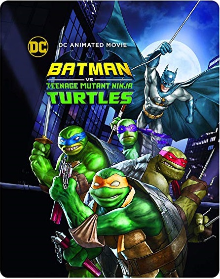
That said, although I do not foresee a future in which Donatello becomes the new leader of the Teen Titans or anything, I think that being under the same corporate umbrella will make crossovers easier and more likely. It’s happened before. The Turtles have had four separate comic book crossovers with Batman, one of which was adapted into an animated movie, and they’ve freely crossed over with dozens of other properties over the years – Ghostbusters, Strangers Things, Masters of the Universe, Mighty Morphin Power Rangers, Naruto, and that’s just off the top of my head. Having them cross paths with the Justice League is in no way out of the question. Heck, having them cross paths with Bugs Bunny isn’t out of the question.
“Dude, our dad is like, a bat without wings! We could be cousins!”
Just because I don’t think the Turtles will be part of the DCU, though, that still raises the question of who is going to publish them. The Turtles have been licensed to IDW Publishing for many years now. So have other Paramount properties, most prominently Star Trek. And just last year, IDW launched a new IDW Dark line of horror comics, including several series based on Paramount properties such as The Twilight Zone, Event Horizon, A Quiet Place, and Smile. I don’t know exactly how long those contracts have left, but once Paramount owns one of the Big Two comic book publishers, will they really want to continue licensing their properties to one of the…Fluffy Five? I need better nicknames.
“Move? We just GOT here!”
It’s possible that Paramount would move the comic book licenses for their properties over to DC, but it’s by no means certain. After all, DC hasn’t done a ton of licensed comics in recent years, aside from the occasional crossover or a book based on one of their current corporate siblings. They’ve published Star Trek before, of course, but that was nearly 30 years ago, and there hasn’t been any indication that they would be interested in doing so again. And even now WB properties have had recent comics published by companies other than DC, such as Cartoon Network comics published by IDW or the current Space Ghost and Herculoids comics produced by Dynamite.
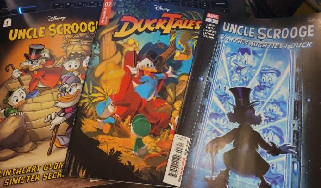
And recent comic book history has made it quite clear that sharing a parent company isn’t necessarily a guarantee of comic book consolidation. When Disney bought Marvel Comics in 2009, they ended the Disney Comics license that Boom! Studios had. Then when they bought Lucasfilm in 2012, they pulled back the Star Wars license from Dark Horse and gave it to Marvel. They did the same with Aliens and Predator when they bought 20th Century Fox. But although Marvel has produced a lot of Star Wars, Alien, and Predator comics, Disney has ALSO licensed Star Wars out to other publishers again, first IDW, and then back to Dark Horse, with their respective series co-existing with the Marvel books. Marvel has also done precious little with the classic Disney characters – a few What If? one-shots mashing Mickey Mouse and friends with Marvel superheroes, and a few Uncle Scrooge comics. But at the same time, Disney kept farming those characters to other publishers as well. Dynamite currently has the license to Disney Afternoon books like DuckTales, Darkwing Duck, and Gargoyles, as well as other properties like Lilo and Stitch, Disney Villains, and – most recently – the Muppets. As for the classic Disney comics, after being moved to IDW (they are in this licensing mix a LOT), they vanished for a few years, only to come back last year at Fantagraphics. In fact, last fall I walked into my comic book shop and bought new comic books starring Scrooge McDuck from three different publishers at the same time.
I guess that made Fantagraphics, Dynamite, and Marvel the Three Scrooges. Ah? AAAAAAAH?
The melding is far from certain, is what I’m getting at.
What about some of the other properties the different companies hold? How will they be affected? Paramount+ isn’t the only streamer they own, they’re also the controlling company of what is possibly my favorite streaming app, Pluto TV. Pluto has on-demand content, but it also has 24/7 channels dedicated to dozens – perhaps hundreds – of individual shows and genres, most of them owned by Paramount: channels dedicated to Star Trek, I Love Lucy, classic sitcoms, game shows, and tons of other things. Not everything on Pluto is owned by Paramount (they also have channels dedicated to Mystery Science Theater 3000, RiffTrax, and the Universal Monsters, for instance), but I don’t think you can currently find any WB properties there. Could we see channels with all-day streams of the Looney Tunes, Scooby-Doo, Babylon 5, DC Cartoons or the live-action DC superhero shows? I have to admit, of all the theories I’m throwing around, this is probably the one I feel most likely to happen in the near future. It just seems very much like the kind of thing Paramount is likely to do. Although – like everything else – how SOON it might happen would depend largely on the current licensing deals they have in place, what rights exactly those existing deals entail, and when they expire.
If all of this sounds confusing…well, that’s because it is. The merger of two of the biggest media companies in the world is an enormous endeavor, something with so many moving parts that I can’t even wrap my head around it. And we just don’t know how it’s all going to shake out in the end.
Blake M. Petit is a writer, teacher, and dad from Ama, Louisiana. His most recent writing project is the superhero adventure series Other People’s Heroes: Little Stars, volume one of which is now available on Amazon. He’s also started putting his LitReel videos on TikTok. He kind of likes the idea of a SpongeBob/Animaniacs crossover where Squidward just rapidly loses his mind over the Warner Brothers and the Warner Sister.
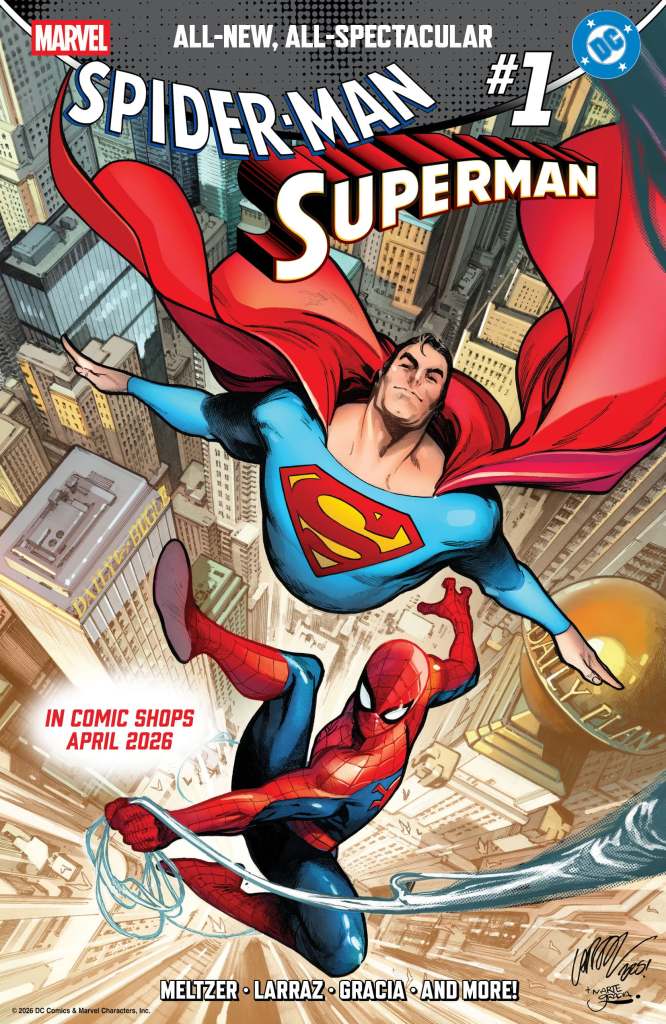
Last week brought us a pair of announcements about upcoming Superman books, both of which I’m happy about, although I’m slightly reserved about one of them.
First of all, Marvel Comics announced the creative teams for their half of the upcoming Spider-Man/Superman crossover. DC announced at the end of last year that Mark Waid and Jorge Jimenez will be doing the main story for their half, which comes out in March. Marvel’s side of the crossover will come out in April, and last week we learned that the main story will be by Brad Meltzer and Pepe Larraz, pitting the wallcrawler and the Man of Steel against Lex Luthor and Norman Osborn. I’ve been a fan of Meltzer for quite some time – I love his novels, I’ve shared his childrens’ books with my son, and I’ve always liked his comics. I was surprised, though, to discover that he’s done almost no work for Marvel in the past – save for a single page in 2019’s Marvel Comics #1000 special, I believe this will be his first Marvel work.
They also revealed the creators and characters that will appear in the back-up features. Dan Slott and Marcos Martin will team up the Golden Age Superman with Spider-Man Noir, Jason Aaron and Russell Dauterman will pit Wonder Woman and the Jane Foster Thor against an army of symbiotes, Louise Simonson and Todd Nauck will turn John Henry Irons against the Hobgoblin, Joe Kelly and Humberto Ramos will chronicle a “campus crossover” between Gwen Stacy and Lana Lang, and Brian Michael Bendis will re-team with Sara Pichelli, with whom he co-created the Miles Morales Spider-Man, in a story where Miles meets Superman. The thing about that last one, though, is that I’m not actually sure WHICH Superman Miles is going to meet, Clark or Jon. The solicitation doesn’t make it clear, and there are variant covers featuring Miles with each of them. This is one of the many, many things that drives me crazy about aging Jon up, but I’m not going to belabor that point here. I’m excited about most of these stories, particularly to have Louise Simonson writing Steel again.
The second announcement that hit this week is for another project launching in April, a four-issue Bizarro: Year None miniseries, purporting to tell the “definitive, indefinitive” origin of Superman’s imperfect doppelganger. This one is going to be co-written by Kevin Smith and Eric Carrasco, with art by Nick Pitarra. I couldn’t think of a better team to do a Bizarro comic, and at the same time, I cannot help but be a bit trepidatious about this one. And anyone who’s familiar with Kevin Smith’s history in comics will know exactly why.
Look – I am a fan of Kevin Smith. I have been since 1999, when my buddy Jason introduced me to what was then still the “Jersey Trilogy” just in time for us to catch Dogma. And I’ve been into most of his comic book work too…when it actually gets finished. Once his film career was established, Smith broke into comics first with stories featuring his own characters, then on acclaimed relaunches of Daredevil and Green Arrow. In 2002, he came back to Marvel for a miniseries, Spider-Man/Black Cat: The Evil That Men Do, which released three of six issues before it vanished. Smith got sidetracked on other projects, and it took three years before he came back and did the back half of that miniseries. But that’s nothing compared to Daredevil/Bullseye: The Target, a miniseries that also launched that year and never made it beyond a first issue. We’re sitting here 24 years later, and that story was never finished.
This became a bit of a theme for Smith. In 2009 he and artist Walter Flanagan (yes, that Walt Flanagan, if you’re a fan of Smith’s movies) produced the first six issues of what was supposed to be a 12-issue saga: Batman: The Widening Gyre. At the time, Smith promised that the second half of the story would be told after a brief hiatus. The hiatus is at 16 years and counting.
To Smith’s credit, he’s totally aware of the problems he had, and in more recent years he’s gotten a lot better about it. Whether it’s because of working with co-writers or just making certain that he has the scripts for an entire project finished before it’s even announced, his work in the past decade has not suffered from the George R.R. Martin-esque disappearances that plagued his comics back in the day. But as someone who’s still curious as to how, exactly, that gyre was supposed to finish widening, it’s hard to hear his name attached to a project without at least THINKING “here’s hoping he’s got all the scripts finished already.”
I think he has. All the same, the Bizarro miniseries is scheduled to run for four issues, starting in April. So here’s hoping we’ll have all four of them by the end of July.
Blake M. Petit is a writer, teacher, and dad from Ama, Louisiana. His most recent writing project is the superhero adventure series Other People’s Heroes: Little Stars, volume one of which is now available on Amazon. Don’t forget, you can check out earlier blogs in the Year of Superman/Superman Stuff Archive! Got a request for a future “Superman Stuff”? Drop it in the comments!
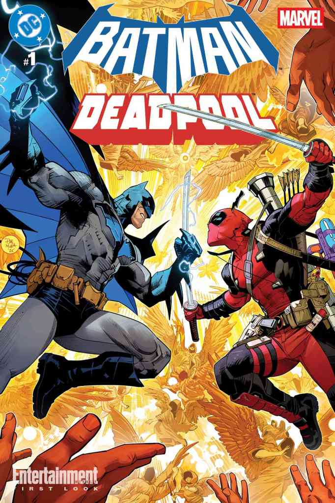
Early in 2024, when DC and Marvel Comics announced that they were overcoming years of – let’s be frank – hostility with one another to release a pair of omnibus editions of their various crossovers from years past, I was excited. Not only that, but I was hopeful that this would lead to further collaborations between the two of them. Earlier this year, that hope was justified when the publishers released their first new crossover in almost 20 years, a pair of books teaming up Batman and Deadpool. Not only that, but each of those books would have several back-up stories featuring other team-ups, such as Green Lantern/Rocket Raccoon, Captain America/Wonder Woman, and Krypto the Superdog/Jeff the Land Shark. And it was nice.
Nice.
And then stuff started happening.
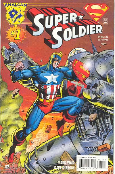
At first, it was stuff that wasn’t too difficult to see as an expansion of this new era of cooperation. Both Marvel and DC have been in the business of publishing “facsimile editions” of classic comics for a few years now – key issues reprinted in their entirety, including the original advertisements, letter columns, and other features that we don’t usually see when a story is reprinted elsewhere. In this spirit, they announced facsimile editions of the original Spider-Boy one-shot from the classic Amalgam Comics event, with a character that mashed up Spider-Man and Superboy (the Conner Kent version) into one hero. This is going to be followed by a facsimile edition of the first-ever meeting between Marvel and DC characters, 1976’s Superman Vs. the Amazing Spider-Man. And then the big magilla – although still not technically anything shocking – they announced that the two Batman/Deadpool comics would be followed some time in 2026 with two new Superman/Spider-Man events.
Awesome sauce, right?
But it didn’t end there, either.
Last week, totally out of the blue, subscribers to the Marvel Universe app (such as myself) got an email announcing a brand-new digital-only comic book…a crossover between Thor and Shazam! Not only that, but it was written by Al Ewing, who has been helming major books for both Marvel and DC for the past few years, including Thor’s ongoing series and DC’s Absolute Green Lantern, among others. Only minutes later, subscribers to the DC Infinity app (such as myself) ALSO got an e-mail, this time announcing a surprise digital crossover starring the Flash and the Fantastic Four, written by former Flash and current Green Lantern and Aquaman writer Jeremy Adams. Both of them were fun reads, totally unexpected, and available for free even if you didn’t have a subscription to the app.
It was like Christmas in November! Or, like every store in North America calls it, “Late Christmas.”
“What a nice surprise,” I thought to myself. It’s really rare that a comic book publisher these days would even change the color of Spider-Gwen’s shoelaces without putting out a press release about it, so a pair of totally unexpected crossovers was a delightful treat.
Then it really started to get weird.
Because the day after the crossovers dropped, Marvel and DC each sent out ANOTHER email. Marvel’s was a code for their subscribers to get a free 30-day trial of DC Infinity. And DC’s email? You guessed it – a code for 30 free days of Hello Fresh.
No, just kidding. Of course, it was a code for a free trial of the Marvel app. And at this point, I started to get uneasy. You see, Marvel and DC have historically been the two biggest competitors in the comic book game. And while there have always been creators who moved freely between the companies, working for one and then the other or even (such as is the case with Ewing) working for them both at the same time, the higher-ups have had a kind of bitter antagonism for the past few decades. Both Marvel and DC have undergone regime changes since the harshest days of the feud, though, and even the Omnibus editions were evidence that the temperature between them has cooled. Even so, seeing them shamelessly promoting each other is…unsettling. Imagine, for example, that you grew up in a household where your parents were fighting all of the time, and then suddenly without warning, the fighting just STOPPED. In some ways, the quiet would be even more disturbing than the fight.
That’s where comic book fans are at the moment. We’ve gone from “Isn’t it nice that Mom and Dad are being friendly again?” all the way around to “What in the HELL is going on?”
Because maybe it’s just me and the basic state of paranoia that exists hardwired right into my brain, but it feels like there’s more happening behind the scenes than the fans are being made aware of. And sure, it could just be more crossovers like Batman/Deadpool or Superman/Spider-Man. Maybe it will become a new annual event. Maybe even more than annual.
Or maybe it’s something else.
This is the only reasonable reaction.
The good thing is that I talk to a lot of comic nerds (shout out to my homies in the best Comic Book Collecting group on Facebook) so I know I’m not the ONLY one who feels this way. A few people have speculated that one of the publishers, or their parent companies, is considering buying the other one. I don’t really think this is the case, and I sincerely HOPE it isn’t, and for a few reasons. First, I think competition is healthy – putting the two biggest brands under a single umbrella would undercut that dramatically. Also, the odds of Warner Bros purchasing Marvel from Disney – one of Disney’s major cash cows, in a time when Warner Bros itself is on the market for a new owner – is virtually nonexistent. The possibility of the WB selling DC to Disney, on the other hand, feels more plausible, but that would be bad because…I’m going to be frank here…DC is crushing it right now. The comic book line’s sales and critical response are up and the movie and TV production is firing on all cylinders, despite what that one jackass who writes for “Cosmic Book News” is desperately trying to convince people. Handing that brand over to Disney and Marvel – whose works, let’s face it, have kind of been declining the last few years – would not be optimal for anybody.
Seriously, compared to “Cosmic Book News,” this thing is the Encyclopedia Britannica.
Another possibility, one that I would be far more open to, would be some sort of distribution partnership. Much has been made about the chaos behind the scenes of the comic book world with the slow death of Diamond Distribution this year, and seeing Marvel and DC cooperate on a new distribution venture would be not be out of the question and, frankly, would probably be a net benefit for the comic shops, although smaller publishers would justifiably be concerned about the two juggernauts creating a new distribution juggernaut before we’ve even buried the ashes of the old one. There’s also the possibility of the Marvel and DC apps perhaps being offered in a subscription bundle, not unlike many TV and movie streamers these days. As someone who has subscribed to both for quite some time, I wouldn’t hate that.
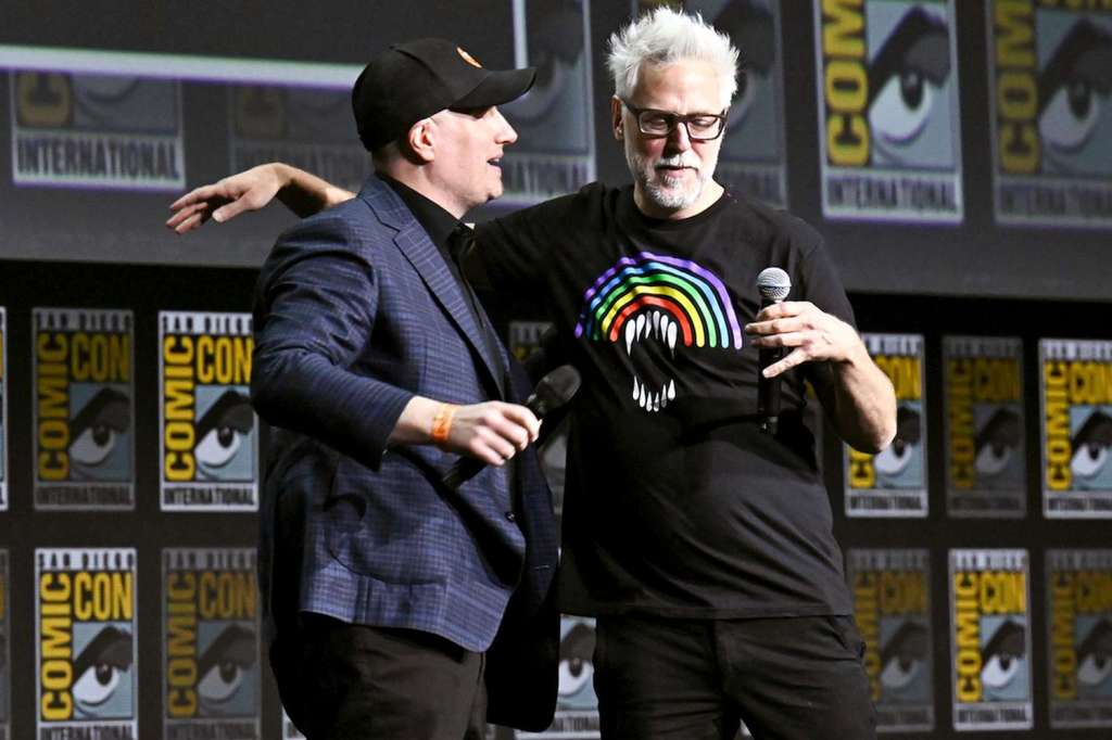
But what if it’s something else? What if the big thing they’re working on isn’t anything behind-the-scenes, but in the content? DC Studios boss James Gunn – whose rise to prominence came from helming the Guardians of the Galaxy movies for Marvel – has spoken more than once about liking the idea of some sort of crossover movie between the two, and Marvel head Kevin Feige has shown effusive support for Gunn himself.
You might even call this photo the smoking GUNN. Get it? GET IT?
And with both studios embracing the multiverse concept, it wouldn’t be that difficult from a story perspective. Can you imagine David Corenswet and Tom Holland in a Superman/Spider-Man movie? They would sell so many tickets that they’d have to bring in a third crossover character, such as the Count from Sesame Street, to keep track of them all.
BUT – and I hate to put a damper on things – Gunn’s DC Universe consists of exactly one movie and two seasons of television so far. There’s more on the horizon, of course – the Lanterns TV series and the Supergirl and Clayface movies are all on the schedule for 2026 – but I feel like Gunn probably needs more time to really establish his DCU before any sort of crossover becomes a real possibility.
The comics, on the other hand, are already well established. And they’ve played the crossover game many times before. But what if this time it was more than just this guy meets that guy? There have been larger crossovers in the past. DC Vs. Marvel not only pitted their entire universes against each other, but also included the Amalgam mashups. JLA/Avengers, famously, featured every character who had ever been a member of either team (at the time – if they did that these days the ways the rosters have expanded they would need another 16 issues). But these crossovers have almost NEVER been addressed in-canon. There have been only two exceptions that I’m aware of, both from DC. First was a random issue of Green Lantern that had a cameo by Access – a character introduced in DC Vs. Marvel with the power to move between the two universes – which happened to be written by Access’s co-creator Ro Marz. Second, an “egg” holding an embryonic universe that was created in JLA/Avengers later became a McGuffin in a JLA storyline written by that crossover’s writer, Kurt Busiek. References to the “other” universe have always been oblique outside of the crossovers themselves, which is understandable due to things like copyright and reprint considerations.
But what if they could get past all that and tell a story that REALLY impacts the two worlds?
They’ve wanted to do it for some time. In the 80s and 90s, there were infrequent appearances in the Marvel universe of a guy in a suit and glasses named “Clark,” always just for a panel or two, but a definite wink at the camera. Other Marvel multiverse storylines have often made vague references to the DC characters as well. DC has also played that game. In his Hawkman series, Robert Venditti heavily explored the fact that Hawkman is a character who has been reincarnated for thousands of years, not only on Earth but on other worlds such as Krypton. But he also dropped hints that some of Hawkman’s reincarnates may have included certain Marvel characters with “Hawk” in their name, such as Starhawk of the original Guardians of the Galaxy.
This is from an issue of Thor. Can you believe he’s using GLASSES as a disguise? What a dork.
Then there’s the big enchilada, Geoff Johns and Gary Frank’s Doomsday Clock, the series which brought the world of Watchmen into direct conflict with the DC Universe. In that story Dr. Manhattan, who lives outside of linear time and can see the past, present, and future as if it’s all happening now, looked ahead to an event he called the “Secret Crisis” happening in 2030. In that crisis, he foresaw Superman fighting Thor (as a character from Norse mythology, anyone is allowed to use the name “Thor” without a copyright issue, so long as they don’t have a picture of the Marvel version of the character), as well as a “green behemoth” who would sacrifice his own life to save Superman, a clear reference to the Hulk. By the way, the Hulk’s comic book, at the moment, is written by Phillip Kennedy Johnson, who is currently writing a miniseries at DC Comics about a character bouncing around in time…dang it, who is that again? Oh yeah…it’s Superman. In fact, the book is called Adventures of Superman: House of El, and it’s tying off plot threads leftover from Johnson’s run on the main Superman comics from a few years ago.
It’s prophecy, people!
Now Dr. M told us that the Secret Crisis would happen in 2030 and I don’t know that they would be making plans today for an event that wouldn’t see publication for another five years, but one of the major reveals of Doomsday Clock was an explanation of the elastic nature of time in the DC Universe, so skirting the exact date wouldn’t really be a problem. And both Marvel and DC are currently playing with the multiverse in various stories. So…y’know.
All of this, of course, is circumstantial evidence. None of it would hold up in court. But as far as pure speculation goes, I find it all AWFULLY interesting. Would it be possible, in this new spirit of cooperation between the two publishers, for them to go forth with a story that actually brings the two universes together in a way that is indisputably canonical? To tell a story that has actual weight and impact on the heroes of two worlds going forward? Would they actually kill the Hulk to save Superman? (I know they won’t kill the Hulk PERMANENTLY, this is comic book spiritualism, where Heaven is easier to escape than a prison in New Orleans. But that’s not the point.)
Ongoing comic books, especially the “Big Two,” exist in a state of what some writers call a “perpetual second act.” What that means is that although there are ongoing stories and things can change, at some point or another there’ll be another reset, because corporate characters like Superman, Spider-Man, Batman, or the X-Men are too valuable to ever take off the table. If the characters were allowed to truly have a “third act,” that would be the END of their story, and nobody REALLY wants that. With that mindset, is there any reason that the next “second act” couldn’t be a story that involves the two largest mythologies in American culture coming together for an event that would have lasting repercussions for them both? It’s worth noting that the original plans for DC Vs. Marvel included having She-Hulk and the Martian Manhunter stranded in each other’s universe for about a year after the crossover ended, but the lawyers at the time told them not to do it. A character swap right now sounds somewhat less impossible.
Is this what Marvel and DC are planning? Are they doing it right under our noses? Is the call coming from inside the house?
Maybe not.
But it’s sure a lot of fun to think about.
Blake M. Petit is a writer, teacher, and dad from Ama, Louisiana. His most recent writing project is the superhero adventure series Other People’s Heroes: Little Stars, volume one of which is now available on Amazon. You can subscribe to his newsletter by clicking right here. He’s also started putting his LitReel videos on TikTok. His own “permanent second act” involves a constant reset of where his son hid the remote control after watching YouTube.
If you’re anything like me, you probably read my columns approximately 97 times after I post them, intent on finding typos and turns of phrase that you think could be improved upon. In fact, if you’ve ever gone back and read a column again only to notice that a word has been changed or a misplaced modifier has been re-placed, that’s probably because I caught the error after one of my meticulous re-evaluations and made the change, which for some reason my wife finds tremendously amusing. But in the course of that obsessive re-reading, you may remember that last week I discussed the news that Mad Cave Studios is going to be publishing a comic book based on the classic 80s film The Last Starfighter. I was, of course, terribly excited about this news and I couldn’t wait to order a copy from my local comic shop. But as I pondered this, something quite disturbing occurred to me. I want to order a copy…but I’m not entirely certain HOW.
Me asking the universe how the hell to order comics anymore.
The comic book market is in quite a quandary at the moment, and like most other problems in the universe, I think it’s at least partially Marvel’s fault. I’m going to give you a heavily condensed version of what’s happened to the comic market over the past 30 years or so, so buckle up. Once upon a time, there were several companies that distributed comic books to the stores of North America. Publishers had deals with multiple distributors, and comic shops and newsstands were free to pick and choose which distributors they wished to do business with. But in 1994, as part of a series of bad business decisions that eventually led to the company’s bankruptcy, Marvel Comics decided to purchase one of those distributors and begin using their own distribution company exclusively. The ONLY way to get Marvel Comics was going to be by ordering through their distributor, Heroes World.
This understandably caused a lot of the other publishers to be concerned. Marvel was – and remains – the biggest publisher of comic books in North America, and everybody knew that all the stores would HAVE to use Heroes World to get Marvel Comics, which meant that many of these stores would start dropping the OTHER distributors, making it harder for publishers to get their comics on shelves. The other publishers, then – DC, Dark Horse, Archie, and more – realized that the last thing they wanted was to put their biggest competitor in charge of their distribution system, and they all rushed to sign exclusive deals with another distribution company, Diamond. Pretty soon, most of the other distributors frittered and died, leaving only Diamond and Heroes World, and even though Marvel was the biggest kid on the playground, they came to realize that even they were NOT bigger than every other kid on the playground put together. Furthermore, Heroes World itself didn’t have enough infrastructure to handle 100 percent of Marvel’s orders, and the company fell into chaos. By 1997 Marvel gave up on self-distribution, shut down Heroes World, and signed their own distribution deal with Diamond.
And then, for about three decades, Diamond had a virtual monopoly on comic book distribution in North America.
Imagine this logo has a goatee and a little mustache to twirl.
This was a situation that pleased nobody (except, presumably, Diamond’s shareholders), but that’s the way things were until a few years ago. The many, many problems Diamond had – such as frequent late, lost, and damaged shipments among other things – finally made some of the same publishers that made them a juggernaut jump ship and look for alternative means of distribution. Without the revenue of the big boys like DC, Marvel, and others, Diamond itself began to atrophy, and now it’s going out of business. Other distributors are beginning to rise again, and for the most part I think that’s a good thing. I sincerely believe that competition helps people – and companies – get better, and the fact that Diamond turned to crap while it had no competition to speak of is evidence of this.
However, there is one thing from the Diamond Era going to cause real problems if it’s gone for good. Once a month, Diamond published Previews, a massive catalog that listed all of the comics, graphic novels, toys, clothes, statues, collectibles, and other paraphernalia that the distributor handled. Comic shops sold the catalog, or sometimes gave it for free to their regular customers, and those customers could then easily look through the listings of virtually every publisher to tell their shop what they wanted to order. When the other publishers started jumping ship, the bigger ones (Marvel, DC, IDW, Image) started publishing their OWN catalogs for readers to use.
There was a time when this MEANT something, damnit.
The problem, hopefully, is becoming clear now. The Big Boys have their own catalogs. But Mad Cave – to get back to my Last Starfighter conundrum – does not. So how will we know when the new comic is available to order? How will we know when it’s scheduled to be released? If and when Diamond goes away entirely, how will we know which of the 38 different variant covers we want reserved for us?
“Well Blake, have you ever heard of a little thing called the INTERNET?” you may be asking, if you’re the kind of person who feels like being a jerk about it. Well yeah, duh, I know about the internet. It’s this box on my computer that I use to edit my columns 194 times after I publish them. And I suppose it’s useful for other things too. If I know a book is going to be solicited soon I can keep an eye out, do searches, even set up a Google alert. But that’s for ONE comic. Are people going to be willing to do that EVERY time they hear about a new comic book they want to read? And what’s worse, what about the stuff that ISN’T made into news but that they would be interested in, if only they knew about it?
What I’m getting at is that this lack of unity could be a crippling blow to a lot of smaller publishers.
Of course, the smaller publishers in question ARE finding distribution. There’s a new distributor called Philbo, for example, that recently started putting out a catalog featuring a sizable number of smaller publishers, including the likes of Red 5, Abstract Studio, Antarctic Press, and Monarch Comics. (Unfortunately for The Last Starfighter, Mad Cave is not among their number, at least not yet.) And even though that physical catalog isn’t necessarily showing up in every shop, it’s available on their website. More good news.
You guys just don’t know how badly I wish I’d been present at the marketing meeting when they chose “Philviews” as the name of their catalog.
The bad news is that if we want a system where readers can find EVERYTHING that’s available, it doesn’t exist anymore. That puts much more of the burden on the potential customer to actively try to stay aware, which also increases the burden on the publishers to find ways to MAKE the customer aware. We’ve built a system where readers will have to fight to stay abreast of virtually every publisher and every distributor and seek them out once a month if they’re to have any chance of finding what they’re looking for. Promotion has always been a challenge for small publishers, and this is only going to make it more difficult.
So what’s the solution? As much as the Diamond monolith hurt comics, I think having a one-stop location for solicitations was beneficial to most publishers, and I think we need that back. There’s a proposal that I wish somebody would take up. Not me, mind you, because I don’t have the time or the technical know-how to build a resource of the type I’m about to suggest, but if anybody else sees this idea and decides to run with it, all I ask is that you tell me when it’s ready.
I think we need a resource that collects the solicitations of all the distributors that service the comic shops of North America. One website, maybe even one app, that breaks these things down so that we can browse and search everything easily. It could, perhaps, be organized by publisher, with links to each distributor that particular publisher works with. Readers and retailers could set alerts for new solicitations featuring their favorite publishers, creators, or IPs. And, of course, customers could read through all the solicits and, at a click, build a list of the books and assorted merch they wish to order that month, which could then be provided to their local comic shop. I know that there have been efforts in the past to build an app that customers could use to send their orders to their shop, but to the best of my knowledge there hasn’t been one that’s as comprehensive or successful as what I’m proposing – certainly not one that has the widespread coverage that the former Previews catalog had.
I think readers and retailers alike would probably welcome such a system, although as I said, I wouldn’t have the slightest idea how to go about creating such a thing. But if you do, give it a shot.
And if you DO know of an app that’s already doing something similar to what I’m suggesting, for Heaven’s sake, let me know about that, too. This is a problem in desperate need of a solution.
Of course, this only applies to people who read PHYSICAL comics. Digital comics are a whole different animal with a whole different set of problems. But there are – fortunately – people seeking a solution to that one.
We’ll talk about that next week.
Blake M. Petit is a writer, teacher, and dad from Ama, Louisiana. His most recent writing project is the superhero adventure series Other People’s Heroes: Little Stars, volume one of which is now available on Amazon. You can subscribe to his newsletter by clicking right here. He’s also started putting his LitReel videos on TikTok. He lives for the day when he can set an app to alert him to new Captain Carrot merchandise.
It happened when I got home from work on Aug. 13. I turned on my laptop, began to scroll Facebook, and saw the news I’ve been waiting for:
“Superman coming to 4K, Blu-Ray, and DVD on Sept. 23!”
Ah, a little something to take the edge off.
Rumors about a release date have been bouncing around for weeks now, but I have reached a point where I ignore anything that isn’t official from DC Studios. When I saw that the Blu-Ray was, in fact, available for pre-order, I showed it to my wife.
“Are you going to pre-order it?” she said.
“I don’t know. I know what’s gonna happen. I’m gonna pre-order it, then a week from now they’re going to announce some super ultra mega special edition that I’m going to have to get.”
“Well then wait.”
“But I want it.”
And then she gave me that Look (married guys reading this know exactly what Look I’m talking about) as I clicked pre-order and proudly announced that I saved $9.99 on shipping thanks to Amazon Prime.
Notes: For a few years now DC has been on a pretty good streak with their seasonal anthology specials, including ones for Valentine’s Day, Halloween, the December holiday smorgasbord, and then one that’s more generically “Summer.” The best thing about them are the titles. Are You Afraid of Darkseid? Grifter Got Run Overy By a Reindeer. How to Lose a Guy Gardner in 10 Days.
Awesome.
This summer’s special is Kal-El-Fornia Love and, for the first time in memory, it’s a seasonal special that is entirely focused around a single corner of the DCU, in this case, the Superman family having adventures on the West Coast. What else do you expect from the Summer of Superman? It came out a few weeks ago, but I hadn’t gotten around to reading it until now…I have to be honest, it always kinda bugs me that DC puts out their “Summer” specials right around the time that my summer vacation ENDS and I go back to work. If you can drop a Christmas special in November, DC, how about giving us the summer special in June next year?
The special kicks off with “See Spot Fly,” a Superman story by Bryan Q. Miller and Gerardo Sandoval. I know I wrote just a few weeks ago about how good Miller’s Multiversus miniseries was and how I wanted to see more from him, but…this wasn’t it. In the story, something falls from the moon and crashes into the western seaboard, prompting Superman to leap to the rescue…and somehow Lois is Loising in a way that doesn’t really solidify. It’s so weird, Lois is in danger and it’s obvious that Superman has to set out to save her, but the story jumps from the thing falling to Earth to Superman on the rescue so abruptly that I looked back three times to see if I had skipped a page. The story feels woefully incomplete and it doesn’t make a to of sense, and that makes me sad.
“The Gorilla Ex-Wife of Jimmy Olsen” is a sequel to Superman’s Pal Jimmy Olsen #98, a comic I’ve actually never read but which features Jimmy Olsen marrying a gorilla, so I don’t know why the hell I don’t have eleven slabbed copies already. Written by Christof Bogacs with art by Jacoby Salcedo, Jimmy encounters his gorilla ex-wife, Bruna, an actress, whom he has not seen since be broke her heart. But now she’s mated with (and managed by) Gorilla Grodd. Jimmy is at a Hollywood party to get photos of the new actress, but afraid of an awkward conversation, he instead challenges Grodd to a “Gorilla Games” competition, because that sounds like an amazing idea. Bogacs is channeling his inner Matt Fraction here, telling a nicely comedic story in a way that feels like it could be a lost chapter from Fraction’s Jimmy Olsen series from a few years ago. In the end, though, we actually get to see a little maturity and growth from Jimmy, which can be rare.
Joshua Hale Fialkov and Bruno Abdias give us Power Girl in “Before Sunrise,” although you wouldn’t know it at first. The story actually kicks off with Ice enjoying a basketball game by herself when some nutjob tries to shoot up the place. Ice has the situation handled, but finds an unexpected assist when Power Girl shows up. The bad guys are dispatched quickly and the rest of the story is Ice and Power Girl kind of having a girls’ night – not a party night, but a night where they just go out and engage as friends, having conversations about their lives and their place in the world. It’s an odd little story, the sort of thing that I somehow doubt will ever be referenced again, but there’s a sweetness to it that I find pretty endearing. And I love the way Abdias draws both of the heroines.
“Against the Wind” by James Reid and Jon Mikel gives us Bizarro on a journey to become a hero. At least…he TRIES, but things like saving kittens from a bridge collapse instead of the humans using the logic that the kittens (unlike the humans) would never have had swimming lessons makes it a little hard to take him seriously. When he hears that there’s an open casting call for actors who want to play Superman in a movie, though, he sees a chance. I have mixed feelings about this one. It’s funny, it’s genuinely funny, but it also doesn’t seem as though Reid quite gets Bizarro. He’s an imperfect duplicate, he does the OPPOSITE of what he’s supposed to do, but that’s not what happens in this story. Is it FUNNY when he winds up at Mardi Gras instead of Hollywood because “Louisiana” and “Los Angeles” are both abbreviated “L.A.”? Sure. But that’s not OPPOSITE, that’s just him being stupid. The whole story is full of stuff like that, stuff that works for a GOOFY character, but doesn’t make sense even for Bizarro logic.
Lois Lane stars in “Bite of the Apple” by Meghan Fitzmartin and Marcial Toldedano Vargas. Lois is invited onto a podcast hosted by a razor-tongued host who wants to take Lois to task for her coverage of a recent murder case. Turns out there’s more to the podcast that meets the eye. It’s…okay. The story has a good handle on how Lois views the responsibility of a journalist, but it doesn’t really explain why she’d agree to be on a podcast like this in the first place, let alone why Wonder Woman shows up at the last second. (She says Lois’s sister contacted her. How the hell does Lucy Lane have Wonder Woman’s phone number?)
“Across the Room” by Brandon Thomas and Juni Ba stars the Steels, John Henry and Natasha Irons, hitting the beach on a little vacation. At least, they’re trying, but stuff just keeps happening. This is another confusing story, but this time I have to feel like the art is at least partially to blame. The story is kind of about Natasha hitting it off with a girl at the resort they’re staying at (in-between scenes of her behaving like a petulant teenager for no apparent reason), but there’s a focus on a Superman “birthmark” she has on her ankle. It’s drawn in such a way, though, that at first I wasn’t even sure whose ankle I was looking at. When it turns up again, when she’s in armor, there is ZERO explanation for why it’s visible. Where did her armor GO? Why is her foot bare? There’s goo on it – is the monster she’s fighting made of acid? Comic book art has to tell a story, and this one kind of falls short on that front.
Dave Wielgosz and Joey Vazquez give us “Who Do You Belong To?” The story starts with Jon Kent in flight over the forests of northern California trying to investigate something that has been ripping up the trees. The creature turns out to be an escapee from Cadmus, though, and he’s already got another member of the family on his trail: Conner Kent. Turns out the “monster” was once his pet at Cadmus, and he’s there to save him before someone destroys him. It’s a good setup, but the execution is a major split decision. Jon feels awkward around Conner, not knowing exactly who they are to one another, which is somewhat fair. Conner feels awkward around Jon because he feels inferior, like compared to Jon he doesn’t quite deserve the name “Superboy,” and that is utterly preposterous. Conner Kent was around for two decades of real time before Jon showed up. He proved himself time and again. He died saving the entire universe in Infinite Crisis. Jon…hasn’t. There is no world in which I accept Conner feeling inferior to Jon. Awkward? Sure. Confused? I’ll take it. Intimidated since Jon is Superman’s “real” son? Fine. Inferior? Hell no. This story is SO symptomatic of the fact that DC does not know what to do with these two characters anymore, a problem exacerbated by the fact that of Jon’s two identities, neither of them fit anymore. He was Superboy when Conner was MIA. He became Superman when his father was off-world. Now they’re both back and he has no identity. Even the recent Secret Six miniseries has been calling him “Super Son,” which is better than sharing somebody else’s name, but hardly a sustainable identity.
For God’s sake, DC, can we please all recognize the fact that the name “Valor” isn’t in use at the moment? I know it doesn’t start with an “S,” but it’s got history and it would at least START to fix this ridiculous problem you created for yourselves.
Anyhoo, the last story in the book is “Something in the Water” by George Mann and Travis Mercer. Supergirl hits the beach only to wind up fighting some sort of giant Kraken-type sea monster. Turns out it’s an eldritch abomination. Fortunately she has a little help – John Constantine drops by for a visit. The story is pretty straightforward, honestly. No twists, no surprises, it’s so barebones that it almost feels like a lost plot from the Silver Age. That said, the art is great, and the wildly different personalities between Kara and Constantine makes for a fun couple of pages.
I wish I liked this book more than I did, but of the eight stories, only the Jimmy Olsen, Power Girl, and Supergirl stories left me feeling fully satisfied. Three out of eight isn’t a great score.
Thurs., Aug. 14
It’s been sitting here all year, and I think the time has finally come for me to dig into the second of the two DC Vs. Marvel omnibus editions that came out last year, the one collecting the original DC Vs. Marvel miniseries, most of the Amalgam one-shots from the two waves that were released, and the two sequel miniseries DC/Marvel: All Access and Marvel/DC: Unlimited Access. It’s gonna take me a minute to get through this whole monster because, although the Year of Superman is clearly my calling, I do still have a job and a wife and a child. And I’m not going to write about EVERY comic in the omnibus either, just the ones featuring Superman, a member of the Superman family, or one of their Amalgamated versions. If I happen to hit a day where none of the books I read for this feature a Super, I’ll have to squeeze in some other content to keep the streak alive.
It’s a thankless job, but somebody has to do it.
Comic Books: DC Vs. Marvel #1, Marvel Vs. DC #2, Batman: Gotham By Gaslight-A League For Justice #1 (Team Member), Jon Kent: This Internship is My Kryptonite #3
The shot heard ’round the nerd world.
Notes: This epic crossover, written by Ron Marz and Peter David (alternating issues) with art by Dan Jurgens and Claudio Castellini (jamming together on all four) starts simply: Spider-Man swinging through New York City and encountering a man trying to hold together a glowing cardboard box in an alley. He drops in to investigate, only to be struck by a shaft of light that transports him across universes to Gotham City, where he encounters the Joker. The box continues to send out streams of light, striking hero and villain alike and transporting them from one universe to another. As new alliances are forged, Clark Kent is paired up with the Daily Planet’s newest photographer, Peter Parker, and together they hope to solve the mystery. Meanwhile, in a place between worlds, the Spectre and the Living Tribunal are helpless to watch as two gargantuan entities, the Brothers, come into contact with one another. In the second issue, we learn that the Brothers were cosmic entities who came to blows untold eons ago, splitting into two different universes and forgetting their connection to one another. Now the awareness has returned and each brother, the embodiment of a different universe, seeks to prove his worlds’ superiority. They plan a contest, each choosing 11 champions from their respective worlds to do battle, with the world that loses vanishing forever. The first round ends with DC ahead 2-1, with Flash beating Quicksilver, Aquaman beating Namor, and Thor beating Captain Marvel. Meanwhile, a young man named Axel Asher learns the truth of his life – he is a sentient piece of the Brothers, and his powers are awakening.
I was in college when this miniseries came out, and when I say it was a big deal for comic fans, there can be no understating that. These were the fights that we’d been debating our entire lives, and now they were gonna be canon. Not only that, but fans were gonna get to VOTE on five of the eleven matches. And it was done by an all-star creative team, with only Claudio Castellini being kind of an unknown here in the States. It was a dream come true.
Looking back on it all this time later, there are things I like and things I don’t. In his introduction to the book, Ron Marz says that the decision was made to use the contemporary versions of the characters, such as the Ben Reilly Spider-Man, the long-haired Superman, and Thor wearing…whatever the hell he was wearing in the 90s. The argument was that part of the impetus for the miniseries was to pump new excitement into a comic industry that was in trouble, thus using the characters as they were currently appearing in the comics made the most sense. From a business standpoint I get it, and it worked, but you can’t deny that it dates this book badly, locking this in to a specific time period much more than many of the other crossovers I’ve read. Despite that, there are little moments that I just love: when Spider-Man meets the Joker, Joker refers to their previous encounters in the Batman/Spider-Man crossover – a crossover that Spidey doesn’t remember, but that the Fourth Wall-leaning Joker does. Peter David, in the second issue, really mines his well of comic knowledge, and do so with good humor as well: we get a scene of Rick Jones and Snapper Carr arguing over who’ll win the battle between Thor and Captain Marvel, for instance, and Aquaman’s victory comes when he wallops Namor with a killer whale, claiming that Namor’s weakness is that he’s too noble to cheat.
Superman’s part in the first two issues is somewhat minimal. We see him meet up with Juggernaut at the beginning, then it’s more of a Clark Kent/Peter Parker (but still Ben Reilly, don’t ask) team-up as they poke around fruitlessly, trying to figure out what’s happening. I like seeing those two characters together, but as their investigations ultimately go nowhere, it feels a bit like wasted space. Marz and David clearly were doing the best they could to have the characters of each world collide with one another on every page, and some of those pages feel like they could have been handled differently.
There’s a nostalgia inherent in these pages that I love, however, and even just two issues into this enormous book, I’m having fun already.
Notes: The third issue of Marvel Vs. DC is the main event, the issue where the rest of the battles are revealed, including the five matchups that the readers were allowed to vote on. It’s also, in many ways, the least satisfying part of the story, largely BECAUSE of those matches. Sure, there’s fun to be had in having the characters face off against each other. That’s kind of the point of the whole thing. But by leaving the results open to a vote, we were left with several fights that didn’t really work. I’m not the sort of reader who likes to get into the “who would in in a fight?” arguments online because the real answer is always the same: whoever the writer wants to win. But even then, it’s incumbent upon the writer to come up with a satisfying way to reach that conclusion, and that doesn’t always happen here with the fights that are nothing more than popularity contests. Storm defeats Wonder Woman by striking her with a bolt of lightning, something that a character of her power level should be able to shrug off with minimal trouble. Lobo loses to Wolverine by DUCKING BEHIND A BAR and having Wolverine as the only one who pops up, a cop-out so egregious that even writer Ron Marz recognizes it in the introduction to the Omnibus. And Batman manages to beat Captain America only because the latter is struck by a wave of storm runoff flushing through the sewer where their fight is taking place. None of these are satisfying in a narrative sense.
The two audience-decided fights with results I DO agree with, coincidentally, are the two fights involving a member of our Superman family. Superman faces off against the Hulk, and this being one of the eras in which the Hulk had Bruce Banner’s mind, getting him angrier doesn’t automatically ramp up his strength to absurd degrees as happens with some writers, so Superman’s victory is really never in question. Then Superboy faces off against Spider-Man, and although Superboy is far more powerful than Spidey, I give the tip of the hat to Spider-Man’s experience. Even this Spidey, the Ben Reilly Spidey, has had years of practice taking down opponents much more powerful than he is, so taking down a cocky Superboy isn’t a stretch.
This issue ends where the real fun begins, though, with the two Brothers deciding NOT to eliminate the losing universe after all, but instead attempting to re-form into a single being. In so doing, their universes merge as well. The Marvel Universe is gone! The DC Universe is gone! In their place stands only the AMALGAM AGE OF COMICS, a line of one-shots featuring merged version of the heroes of two worlds. The Amalgam comics had a great conceit – not only were they mashups of the Marvel and DC heroes, but they were written in such as way as though they had existed since the Golden Age, that there was a whole universe of history behind them, and that we were just seeing the first issues of a relaunched wave of titles.
“When Super-Soldier throws his mighty shieeeeeeld…”
Super-Soldier #1 is the first such issue in the volume, a comic by Mark Waid and Dave Gibbons featuring a fusion of Superman and Captain America. In 1938, an alien spacecraft crashed on Earth with no survivors, but the government used samples from the alien remains to enhance the ongoing super soldier program, giving incredible power to a new hero who could have won World War II almost singlehandedly had he not been lost in battle with the insidious Ultra-Metallo. It would be 50 years before he was found frozen in ice and thawed out by the Judgment League Avengers, returning to the world as Super-Soldier. Now, an attack on Daily Planet editor Jimmy Olsen sends the Super-Soldier into battle with his arch enemy: Lex Luthor, the Green Skull.
It’s a little hard to assign credit for this one. It’s unclear how much of the world is the result of the creative team of any individual issue and how much can be attributed to the think tank that crafted the Amalgam Universe as a whole. I’ll err on the side of caution, though, and praise Mark Waid and Dave Gibbons for just how well this comic book works. All the little bits and pieces of both Superman and Captain America lore link together seamlessly, without some of the clunky leaps in logic that plague many of the other Amalgam comics. It’s probably because this book had (in my opinion at least) the most talented creative team of the entire lot, but I loved Super-Soldier. I also love the fact that the Omnibus also includes a lot of the supplemental material, such as the fake letter pages from the original comics that drop nice tidbits about the world of Amalgam comics in the midst of inside jokes and Easter Eggs. It makes the read all the more enjoyable.
Sat. Aug 16
Short Film: Krypto Saves the Day: School Bus Scuffle
Look at that good, good, dopey-looking good boy.
Notes: I got an unexpected surprise this morning when I discovered that DC Studios has dropped the first of four Krypto animated shorts on their YouTube channel. School Bus Scuffle is first, with Coastal Catastrophe, Halloween Havoc, and Package Pandemonium all coming (presumably) soon. I love the fact that Krypto has kind of become the breakout character from the Superman movie (now available digitally!) and I’m gleeful to see what else they do with our good boy.
Written and directed by Ryan Kramer, in this short Krypto catches a glimpse of a pigeon and embarks upon an epic chase across the skies of Metropolis – a chase that quickly spirals into potential disaster for a school bus on the way to Metropolis Elementary School. Like in the movie, Kramer’s Krypto is very dog-like – easily distracted, prone to chasing things that look interesting, and with the potential to cause some real chaos with just the wag of his tail. But despite that, he shows that he really is a good boy at heart. There’s a lot of humor in this short, including running bits with the kids in the bus (including one who’s taking a nap) that are particularly amusing. I’m really looking forward to the next three shorts in this series.
Comics: Bruce Wayne: Agent of S.H.I.E.L.D. #1, Spider-Boy #1
Notes: Although Bruce Wayne: Agent of S.H.I.E.L.D. by Chuck Dixon and Cary Nord doesn’t feature Super-Soldier or any other Superman family Amalgams, I thought it was worthy of mention because it does carry over the Green Skull Lex Luthor from Super-Soldier #1. In this one, Bruce Wayne’s parents were assassinated by Hydra as a child, prompting him to join S.H.I.E.L.D. when he grew up. Now he’s risen through the ranks and turned the spy organization into his personal army with one goal: vengeance against the Green Skull. Flash forward to the present day and he’s using a rig designed by Tony Stark to lead a strike force against Hydra, including special agents Moonwing (Moon Knight/Nightwing) and Huntress (Sharon Carter/Barbara Gordon). This is an interesting one, showing that the “Amalgamations” aren’t always one-to-one. Madame Hydra, for instance, is secretly Selina Luthor. Jason Todd shows up in a Deathlok suit, although the characterization doesn’t really fit either of them, and Bane MAY be mashed up with Crossbones, but he may just be mashed with a generic Hydra mook, too. We get to see Sgt. Rock with Nick Fury, though, and that’s good times.
Alas, ‘Ringo, we hardly knew ye.
Spider-Boy #1, by Karl Kesel and the late, legendary Mike Wieringo, is still one of the favorites of this event, and in fact, it was recently announced that this will be the first Marvel/DC crossover book to get the facsimile treatment that’s so popular these days. Mashing up Spider-Man and Superboy was probably a clever little joke on the fact that, act the time at least, they were both clones, and the result is one of the highlights of the entire DC Vs. Marvel era. The book opens up in Project CADMUS, with the titular Spider-Boy defending the genetic project from the invading Bizarnage. From there we get a glimpse of his origin: part of an experiment to replicate the Super-Soldier project, it wasn’t entirely successful, killing geneticist Peter Parker in the process. The resultant specimen had a portion of Super-Soldier’s strength and the ability to alter his personal gravity, making it appear as though he could cling to walls, thus the spider-theme.
I can only imagine the fun Karl Kesel had putting all the Super and Spider Lego pieces together in new ways here. The kid is raised by his “Uncle Gen,” aka GENeral Thunderbolt Ross, who is killed by a burglar. He creates a secret identity paying tribute to his two late “fathers,” calling himself Pete Ross. And Cadmus’s staff include a murderer’s row of big brains from both universes: Reed Richards, Ray Palmer, Hank Pym, Otto Octavius. We even get to see S.H.I.E.L.D. agent Sue Storm, her brother Johnny, and Senator Ben “Rocky” Grimm. It’s the kind of absurd thing you create when you’re a kid, or wild fanfiction made semi-canon by circumstances.
All of it is wrapped up in the joyfully energetic and playful artwork of Mike Wieringo, the first face that would go on a Mt. Rushmore of great comic book artists whose careers – and lives – were tragically cut short. Under ‘Ringo’s hand the Kid looks – and behaves – far more like Superboy than Spider-Man, but that’s not a problem. Most of these Amalgams tend to lean a little harder on one “parent” than another, and the glorious mishmash of pieces in this comic book make it more than worth reading. No offense to Dan Slott or Bailey Briggs, but this is the character I’m always going to think of when somebody mentions Spider-Boy.
Sun., Aug 17
1938-2025
This is rapidly becoming my least-favorite part of the Year of Superman, but once again, we’ve lost someone who left an amazing impact on the world of the Man of Steel, and it’s only fitting that we take a moment to pay tribute. Oscar nominee and legendary actor Terence Stamp, best known as General Zod to fans of the Christopher Reeve Superman films, has passed away at the age of 87.
If you grew up watching the Reeve films, then Terrence Stamp is indelibly etched in your mind: a cold, stark face of villainy, with a voice that sends chills down your spine. Who among us can read the words “KNEEL BEFORE ZOD!” without hearing them in his voice? Stamp took a character who had been an occasional antagonist for Superman in the comics to being one of his most recognizable foes to the world at large, probably second only to Lex Luthor himself.
But beyond that, he had an incredible body of work in film and television, including another Superman connection that many of us forget. Despite being most famous as Zod, Stamp was tapped to provide the voice for Superman’s father, Jor-El, for several episodes of the Smallville TV show.
He was one of the greats, and he’ll never be forgotten.
Comics: X-Patrol #1, Assassins #1
Dreams like this are why you don’t eat burritos late at night.
Notes: Continuing my read of the Amalgam books, but there are less Super-connections in this batch. X-Patrol #1 features the titular team (a mashup of X-Force and the Doom Patrol, although like many Amalgam books, it picks up bits and pieces of other characters as well) in battle against the insidious Dr. Doomsday (Dr. Doom/Doomsday – do I really need to point some of these out?) as well as features a quick panel where we see “alternate dimensions” featuring fractured versions of the Amalgam heroes (in other words, the REAL Superman, Spider-Man, Batman, Wolverine, and Wonder Woman).
Assassins is a weird one: Catwoman and Elektra are merged into Catsai (a clever play on words), while Daredevil and Deathstroke are turned into the gender-flipped Dare the Terminator. The two of them are going after the Big Question (Kingpin/Riddler) in this book that, frankly, is kinda dull outside of giving us another half-dozen mashups. I mention it only because of the inclusion of Jimmy Urich, a combo of Jimmy Olsen and Ben Urich, naturally. The reason I’m bringing it up here is because it does kind of raise the question as to HOW tightly the Amalgam Universe was plotted out. We already saw Jimmy Olsen appear as an older version of himself in Super-Soldier, where it was somewhat implied that he filled the “Bucky” role in the Soldier’s World War II-era adventures. Having another mashup of him is curious. Not that this is the only character to appear more than once. This issue also has “Wired,” a combo of Cable and…I’m actually not sure who he’s supposed to be mashed up with. But we already saw Niles Cable over in X-Patrol, where he was mashed with the Doom Patrol’s Niles Caulder.
This is the kind of stuff that only mega nerds would care about, of course. But as an official mega nerd, I reserve the right to care.
Mon., Aug. 18
Comics: Taste of Justice #3, Fire and Ice: When Hell Freezes Over #4 (Guest Appearance)
Yeah, but you’re an easy mark, Arthur, be honest.
Notes: Today is Open House at my school for the fall semester, that night when parents are invited to come down and meet their children’ s teachers, discuss what’s going to happen in my class, and ask me vital questions like “Where’s room 121?” What that means for me, practically, is that I won’t have a chance to go home after work and read anything today. Instead, in the gap between my last class and when the parents start showing up, I’m going to squeeze in a couple of recent items from the DC Universe Infinite app, such as the DC Go! Comic Taste of Justice #3. I mentioned this comic before when I read issue #1: a clever little experiment in which the writer (Andrew Aydin) tries to work in a story surrounding a cooking demonstration. This issue is co-written by real life chefJosé Andrés, who appears in the story as a friend of reporter Clark Kent. Brainiac is doing Brainiac things that threaten the world food supply, with certain island nations being most directly affected, so Clark and Aquaman recruit Chef Andrés to help them feed an island community while the Justice League deals with Brainiac.
I have to give Aydin credit here. The concept of this book requires him to come up with a story that leaves a gap to insert a recipe in each issue, and it can’t be easy to come up with creative ways to do that. The first two issues (the first starring Lois Lane and the second starring Cyborg and Beast Boy) have taken the approach of someone trying to teach someone else how to cook. This time around he’s gotten more creative, using a crisis situation as a backdrop and making the food preparation aspart of the emergency response. We also get to see various Justice Leaguers using their powers to help out, such as Aquaman helping catch lionfish to cook and the Flash cleaning and filleting enough fish to feed the entire community in minutes.
Is the recipe itself any good? I’ve got no idea. I’ve not a chef and I’m pretty sure I’ve never eaten lionfish. But the way they handle things here makes it at least sound appetizing and not too difficult to prepare, which is pretty much what you want out of a comic book like this one.
I also worked in the recent Fire and Ice: When Hell Freezes Over #4. I got the first Fire and Ice miniseries last year because I love those two characters, and I have ever since the Giffen/DeMatteis Justice League days. I decided not to get this sequel series because…well, I love the characters, and I found the first one profoundly disappointing. But not so disappointing that I won’t read it on the app. Superman makes a guest appearance in this issue, as Fire and Ice are in Hell dealing with Neron and Grodd attacks Smallville, which is their current home. There’s a cute little interaction with Superman and Martha Kent (who is a recurring member of the cast), but beyond that, I’m afraid there’s not much to recommend this issue. The supporting cast, like Fire and Ice, have been body-swapped, and the fact that I forgot that until halfway through the book is a testament to how uninteresting those characters have turned out to be. It’s a shame, because Bea and Tora are great characters and I love the fact that they’ve got a showcase. I just wish it were a better one.
Tues., Aug. 19
Comic Books: Doctor Strangefate #1, DC Vs. Marvel #4, Wonder Woman Vol. 6 #23 (Superman guest appearance), New Gods Vol. 5 #8 (Superman guest appearance), Batman: Justice Buster #26 (Superman guest appearance), Jon Kent: This Internship is My Kryptonite #4
Notes: Today I’m finishing off the last of the Amalgam comics and the first DC Vs. Marvel crossover. The Amalgam books are mostly a little bit of silly fun, without contributing directly to the main storyline, many of them even ending on cliffhangers that were never meant to be resolved. The only exception was Doctor Strangefate #1, written by DC Vs. Marvel co-scribe Ron Marz. In this one, Access (the man with the power to step between the worlds) is being pursued by the titular Strangefate and some of his associates: the Shulk (Hulk/Solomon Grundy), Jade Nova (the Kyle Rayner Green Lantern/Frankie Raye Nova), and the White Witch (Scarlet Witch/Zatanna). Access, it seems, has two shards of the previous universes which can be used to separate them, and Strangefate is trying to stop that, knowing that if Access succeeds in restoring the previous universes, his world will be destroyed. Access escapes at the end of the issue, leading into the finale of the crossover. It’s not really a Superman-related comic, and I mention it mainly because it sets up the end. There is one small concession to the Superman mythos, though: Strangefate’s manservant is Mxy, a combination of Dr. Strange’s Wong and, of course, our old pal Mxyzptlk.
Imagine a sound like the biggest zipper in the multiverse.
Finally, DC Vs. Marvel ended the story with Access revealing that he hid the two missing shards inside of Batman and Captain America before the worlds merged, meaning that in this new universe they’re inside Dark Claw and Super-Soldier. He retrieves the shards and manages to “unzip” the universes, but the Brothers are now at each other’s throats. The worlds are on the verge of collapse, the sky itself is bleeding, even J. Jonah Jameson APOLOGIZES to Spider-Man for all the harassment over the years! And Peter Venkman thought dogs and cats living together was apocalyptic!
The destruction of the two most profitable universes in comics is prevented in an oddly fitting way: the Brothers are on the verge of destroying everything when they are confronted by the two men who briefly held pieces of their form, the men among gods called Batman and Captain America. And as each Brother examines the hero from his counterpart’s universe, they both come to the conclusion that the other world ain’t that bad after all and let the universes return to their natural state.
Makes you wish comic book FANS could learn that lesson, doesn’t it?
DC Vs. Marvel, as a whole, was a fun experiment, but it was kind of short on Superman. In this last issue we only see him briefly helping the Hulk fight the Mole Man in the Batcave, which sounds like somebody was doing “Superhero Mad Libs,” and then as Clark Kent arriving at the Daily Planet office so he can be with Lois as they face what they believe will be the end of the world. It’s to be expected, I suppose – a story of this size is bound to be heavier on plot than on character. Then again, that doesn’t mean it HAS to be this way.
I’m not done with the omnibus just yet. There was a second wave of Amalgam Comics, plus the two follow-up miniseries, so next week I’ll tap into the Superman-related issues of each of those. In the meantime, watch out for those bleeding skies.